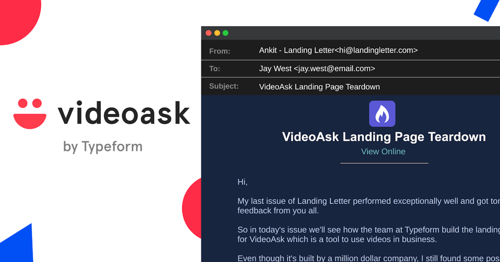
VideoAsk Landing Page Teardown
VideoAsk is a unique piece of tech made by the team at Typeform. Just came through their landing page and found few interesting things to share.


Hi,
My last issue of Landing Letter performed exceptionally well and got a ton of feedback from you all.
So in today's issue, we'll see how the team at Typeform build the landing page for VideoAsk which is a tool to use videos in the business.
Even though it's built by a million-dollar company, I still found some possible things to fix.
Let's see what we can learn from their unique landing page.
Suggestion: If possible try to open the respective landing page simultaneously which you can refer to while reading this newsletter.
A word from our sponsor.
1. Menu bar
VideoAsk is a very unique product and not many people understand what's at all about.
For that same reason, it's important that the landing page should educate the visitor about the product.
Now coming back to the landing page, if you look at the navigation section then you'll find two important links. First is "How it works" and next is "Use Cases".
The primary goal is to teach the visitor all possible use cases.
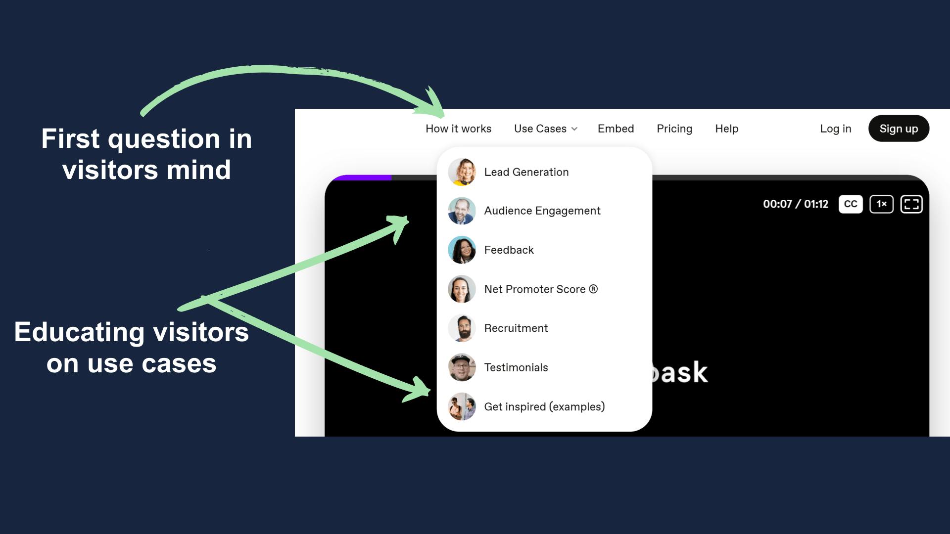
Additionally, there are multiple human faces which does two things. First, that helps in building a personal connection and second is that it signifies that their product is focused on videos and humanly interaction.
2. Hero Section
The hero section on VideoAsk's landing page is full of learning.
First, there is a huge video which talks and shows how their tool works in general.
Also, they did a great job with the headline and kept it as simple as possible but I would have made the headline a little bolder.
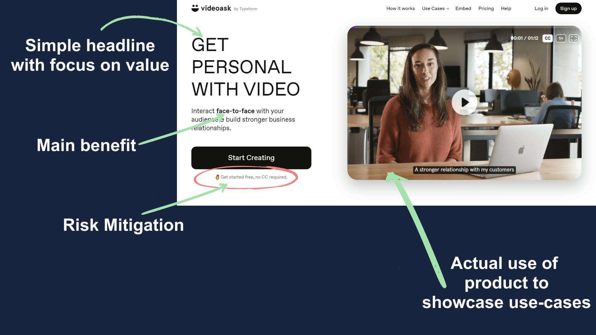
The CTA here is also non-generic and motivates the user to get their first video up and running.
3. Users
Next to the hero section, you'll see a row of logos from their top users.
VideoAsk is a B2B business and knows that businesses prefer to use tools that have been used by other successful businesses.
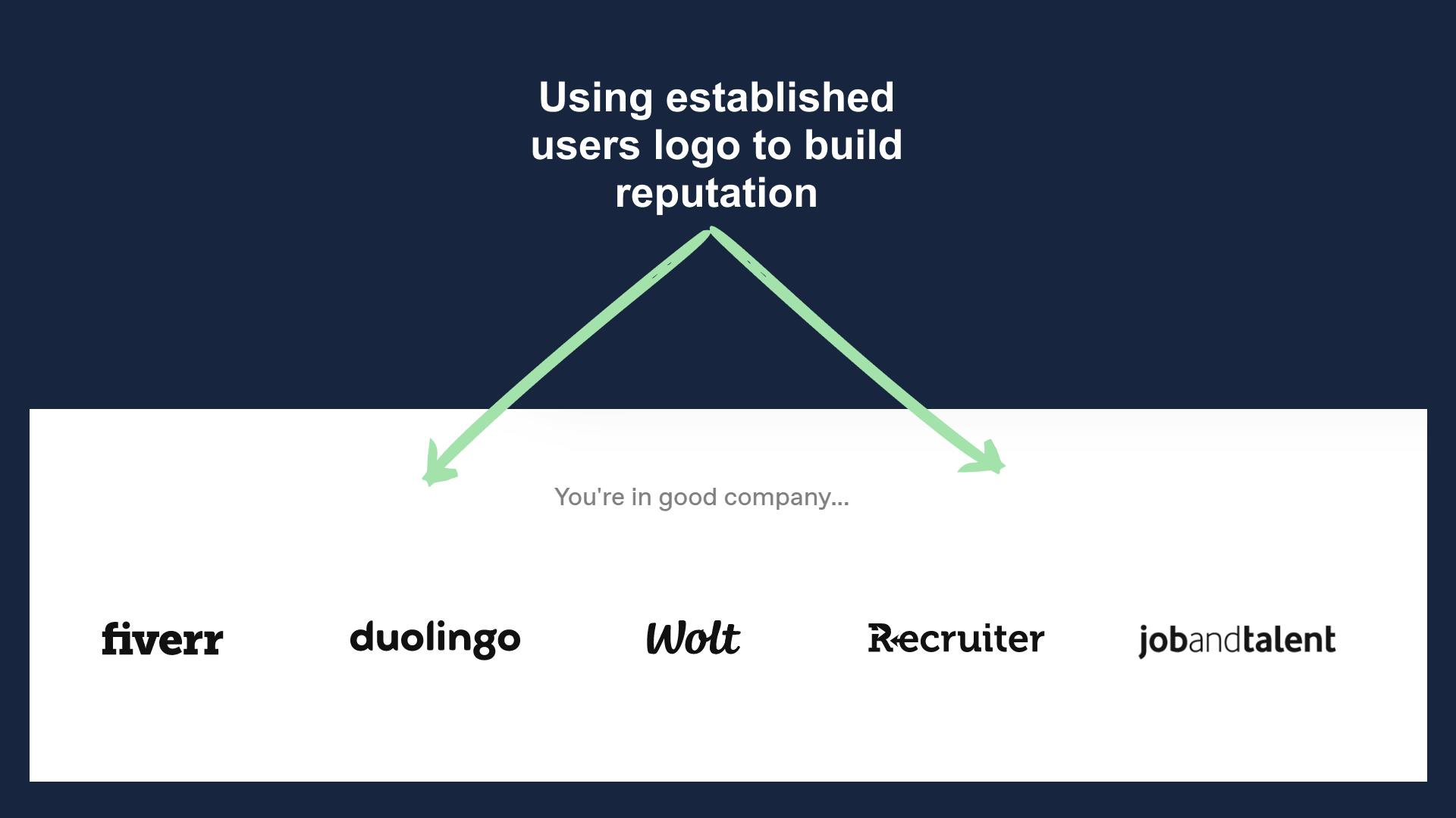
Additionally, they have carefully selected the brands to showcase as they come from diverse niches.
This helps them get the confidence of users for different business types.
4. Body (Explanation)
The first body section of VideoAsk's landing page is all about an explanation of how their software/tool works when implemented.
Though it's a very well made section but I personally feel that the headline here is too complex and could have been simpler.
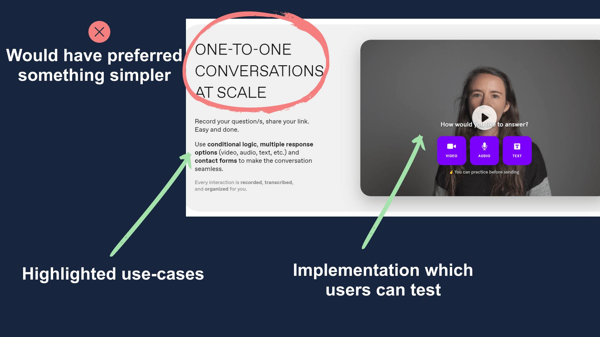
Apart from the heading, everything else is top-notch. Use-cases and features are properly highlighted and the video here shown a completely new way to use it when compared to the hero section one.
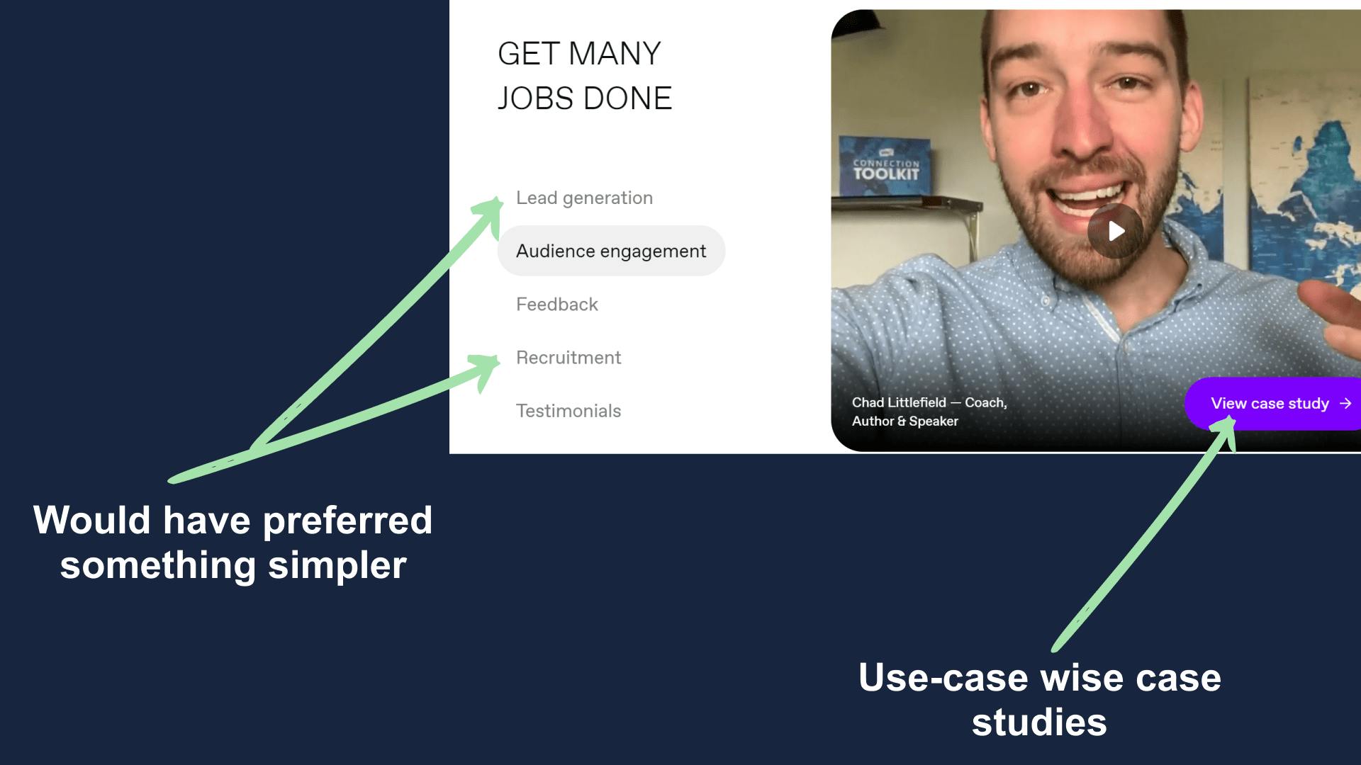
5. Body (Scenario wise use-cases)
This section is all about explaining how VideoAsk can be used in various situations across all industries.
The good thing is that they used their actual customers here instead of hiring models for the same.
This helps them in building a sense of authenticity.
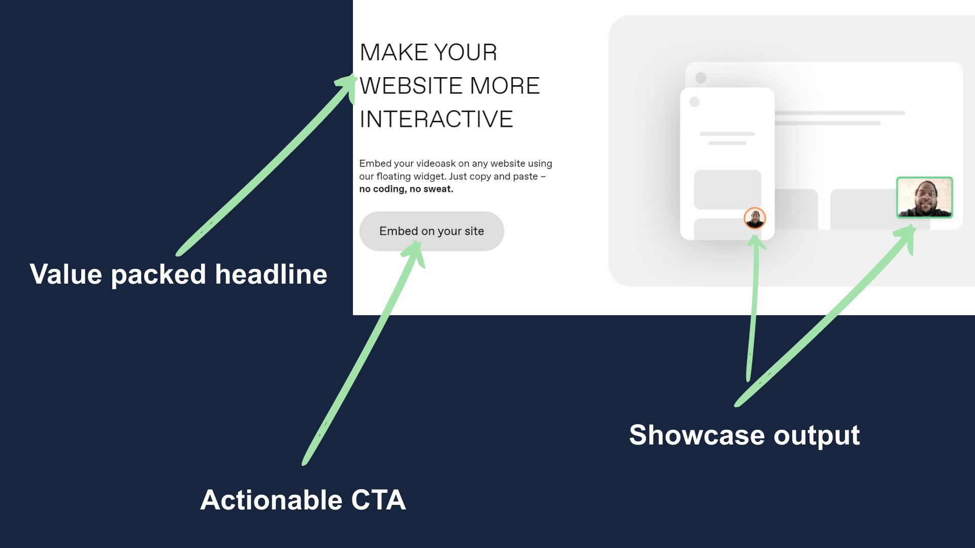
6. Body (Embed widget)
This the only section in the whole landing page which focuses just on a single feature.
Now some of you might ask, why so?
The answer is that they want to let the visitors know that it's very simple and easy to add VideoAsk's widget to any website.
They understand that not many people are comfortable with coding and solving which is a big advantage.
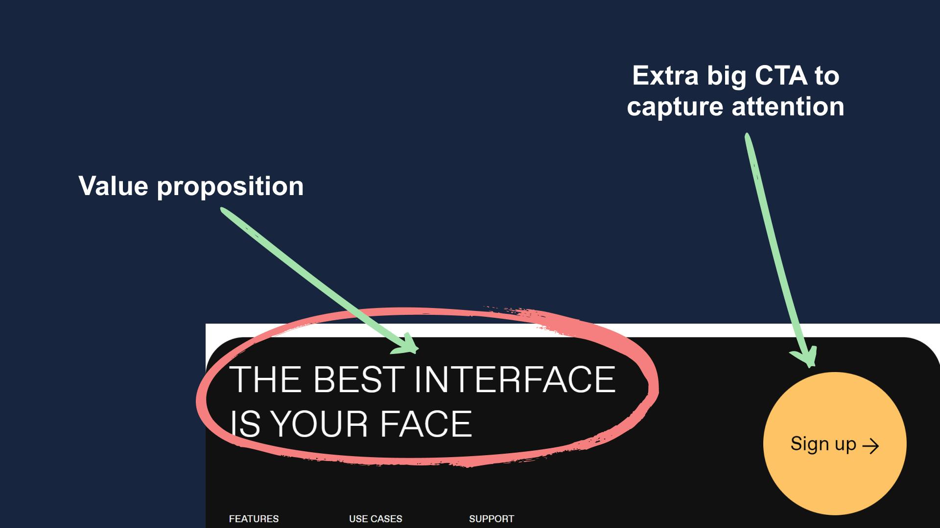
7. Pre-Footer
A question for you all, what's the most prominent thing in the below picture?
The yellow sign-up button, right?
I too saw it the first time and was amazed how they did one simple thing which grabs the visitors attention.
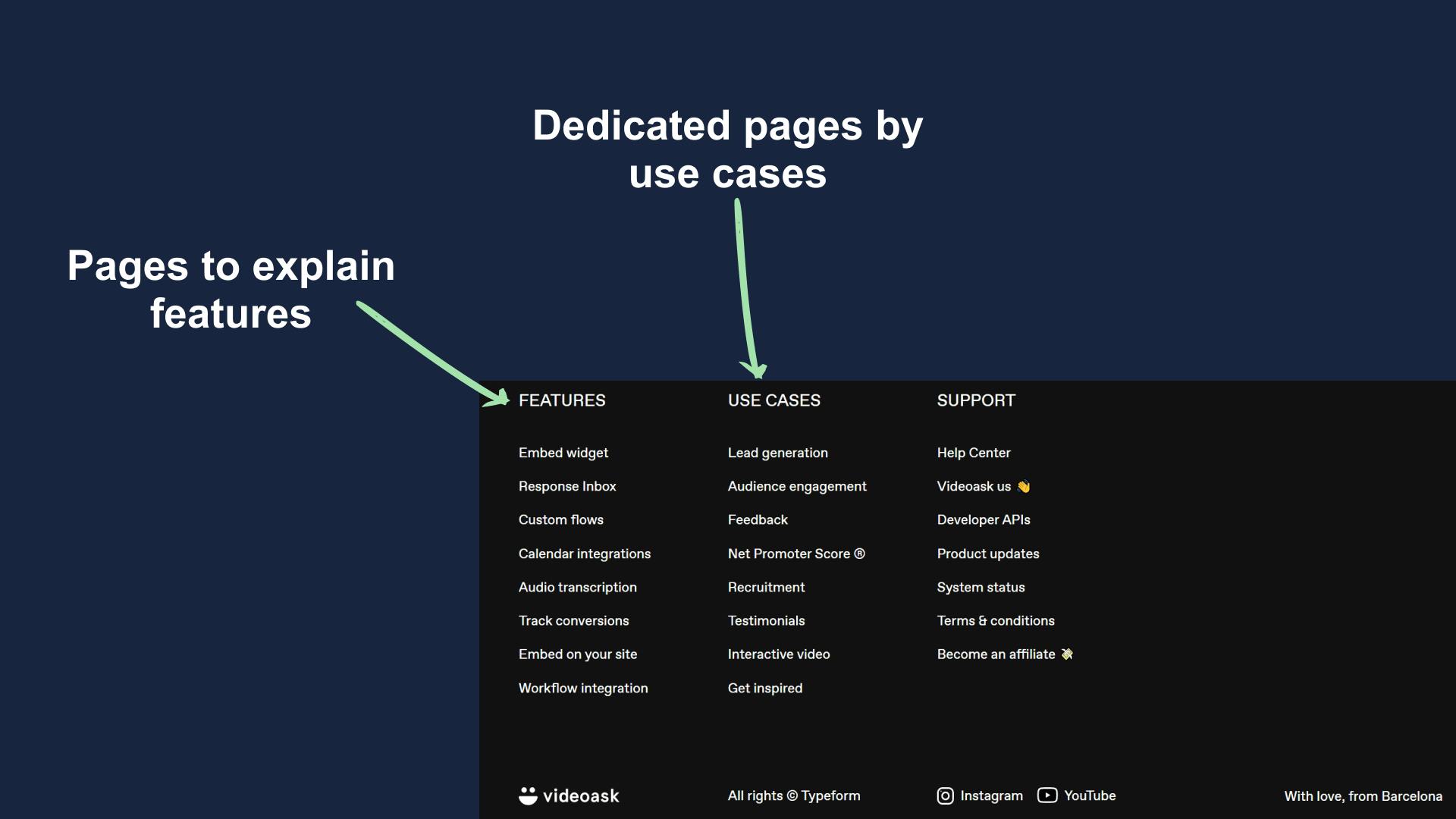
8. Footer
The footer section here is all about explanation and use-cases.
Remember I told you that VideoAsk is a unique piece of tech and they need to explain it before selling?
That thought continues here as well, if someone has scrolled this far and still not signed up then he or she might still be confused.
To fix that confusion there are multiple links that help the visitor get their answer to their questions.
Summary
VideoAsk's landing page is as unique as their product but there are few key takeaways for us.
- Educate before you monetize.
- Use actual product if possible to give hands-on experience.
- Case studies helps get users attention.
- Add customer review or success stories.
- If building a unique product then focus on explanation rather than specification.
Hope you guys have loved this week's teardown and feel free to reply with your thought on the same. Also if you want to suggest a website for our next teardown then do let me know and I'll consider it.
Also, do you mind motivating me with a cup of coffee?
Keep Building,
Ankit