Top pricing page example with teardown
Example of some of the best, creative and high converting landing pages.


Hi,
Today's issue is a different one. I won't be talking about any landing page today. Instead, I'll be showing and explaining some of the best pricing pages.
Pricing pages/sections are one the most vital part and that's what makes the money to keep you going.
Let's see what we can learn from some of the most unique pricing pages.
Suggestion: If possible try to open the respective pages simultaneously which you can refer to while reading this newsletter.
A word from our sponsor.
Example 1
The first example is of a site called GetTerms.io which an online privacy policy generator.
While browsing their website I found one pricing pages very interesting, have a look at it and then I'll explain.
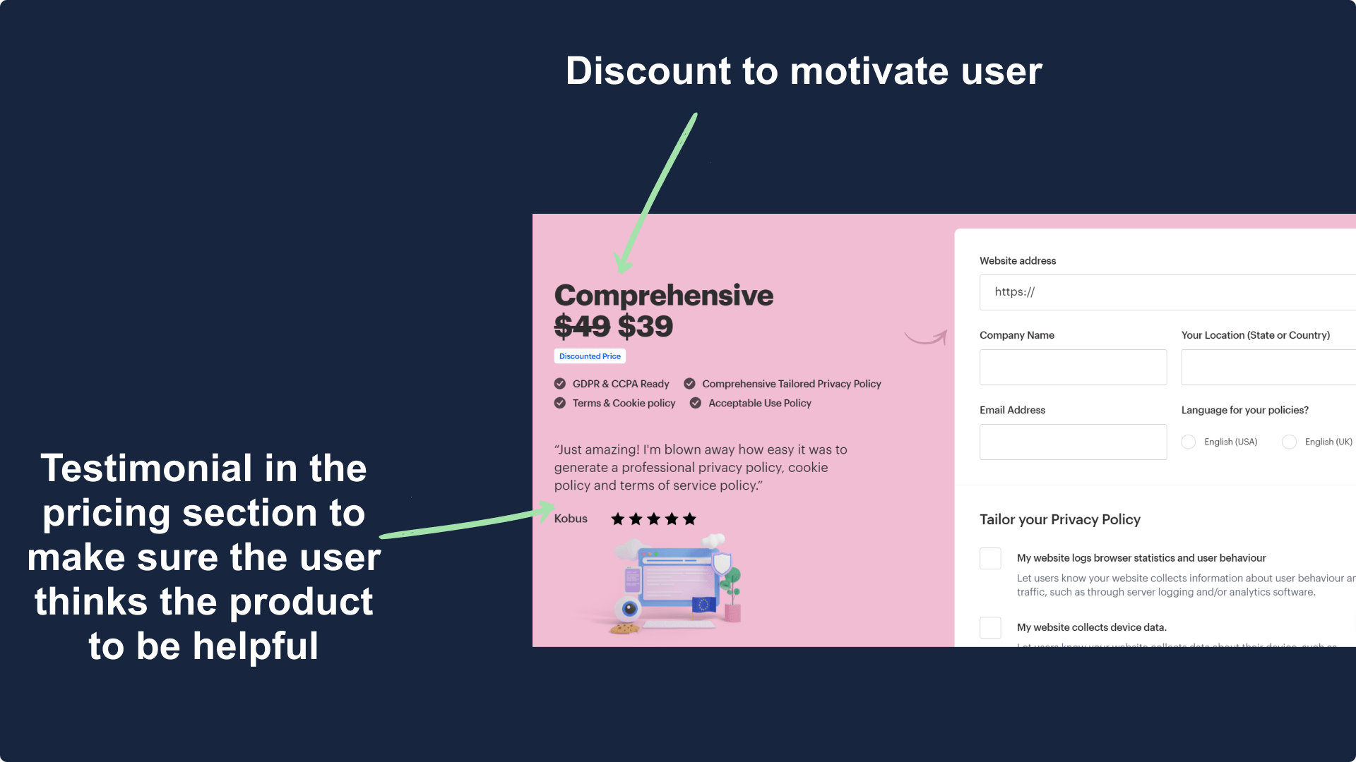
The best part about this page was adding additional user reviews there, this helps them generate product value which leads to higher conversion.
Imagine you are deciding on whether or not to buy apples from a particular vendor but then you see another person giving compliments, won't you be tempted to buy the apples?
Example 2
The next pricing page is by Smplrspace.com, a real-estate service provider.
They do a very good job in making the visitor believe that their annual plan is a better choice.
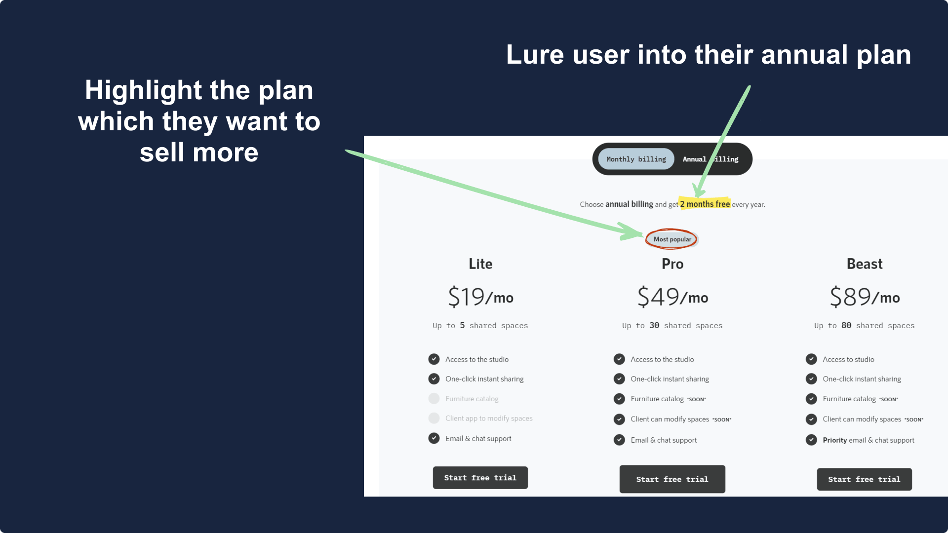
By putting the focus on their annual plan they are able to generate more revenue while retaining the customer for longer.
So always make sure you make that you highlight the plan/term which is most beneficial to your business. Also, offer some initial incentives like a free month or extra discount to make sure people choose the plan you want them to.
Example 3
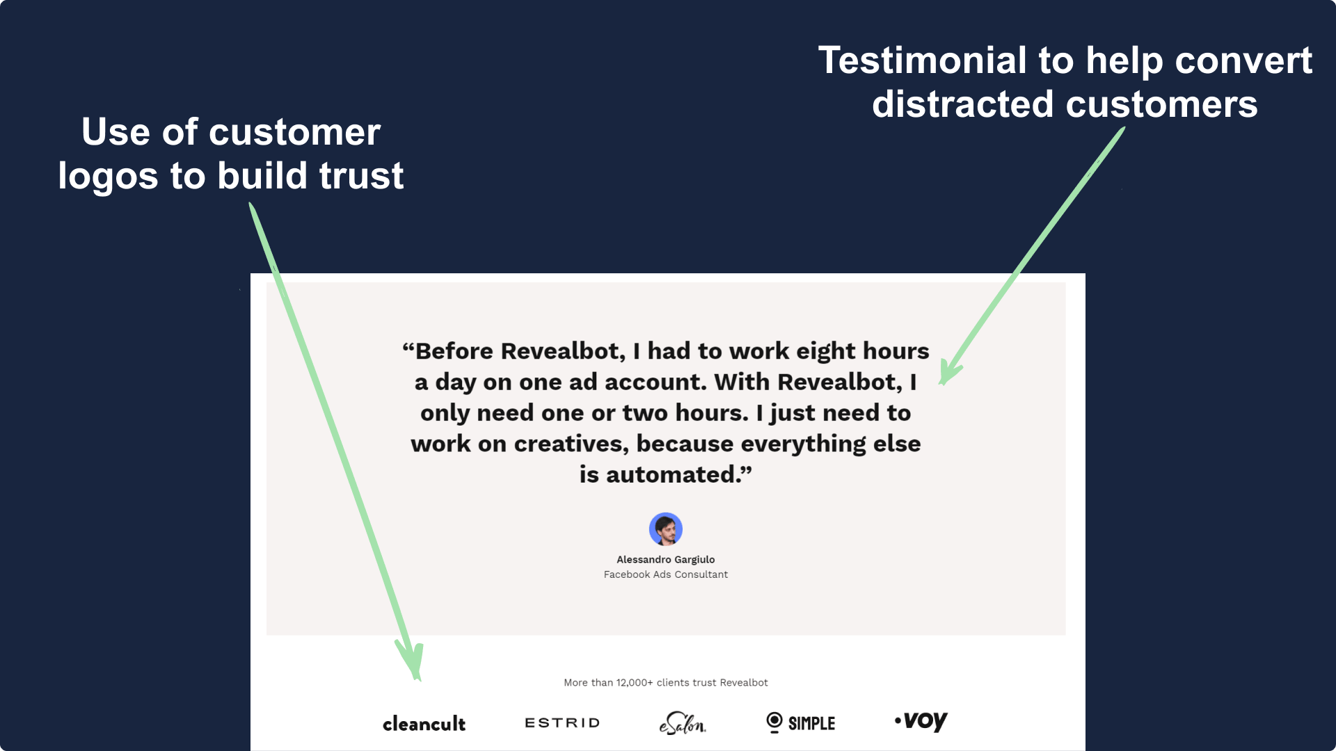
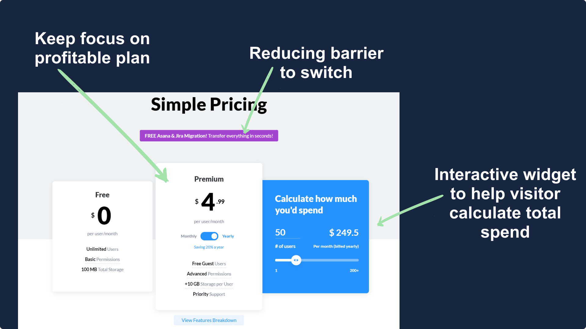
The next pricing page has been picked from Revealbot.com, an ad automation tool.
They made a unique pricing page(with some nice animations) which helps the user find the perfect plan for them.
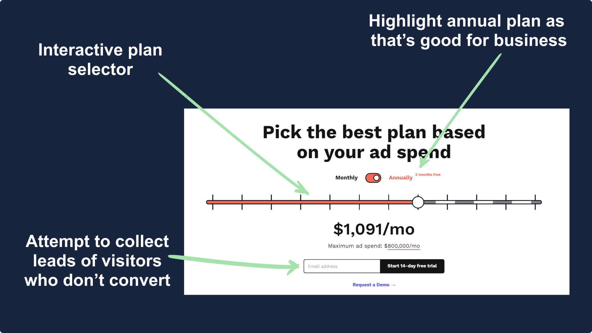
Using a pricing section like this has multiple benefits the top one being engagement.
When you implement an interactive pricing element it engages the visitor into it which results in a better connection.
Also here's another screenshot of their pricing page showing how well they are utilizing testimonials, this section is placed just below the pricing section.
Example 4
The last pricing page example is from Produck.io, an alternative to Jira and Asana.
Asana and Jira are established players and most of Produck's target audience are already using their service.
By highlighting the fact that they help in migration, they reduce the entry barrier.
Also as their product's pricing is per user the visitor needs to calculate the price, having an interactive calculator ensures that they stay there and keep distraction to a minimum.
Below their pricing section lies another important section, have a look.
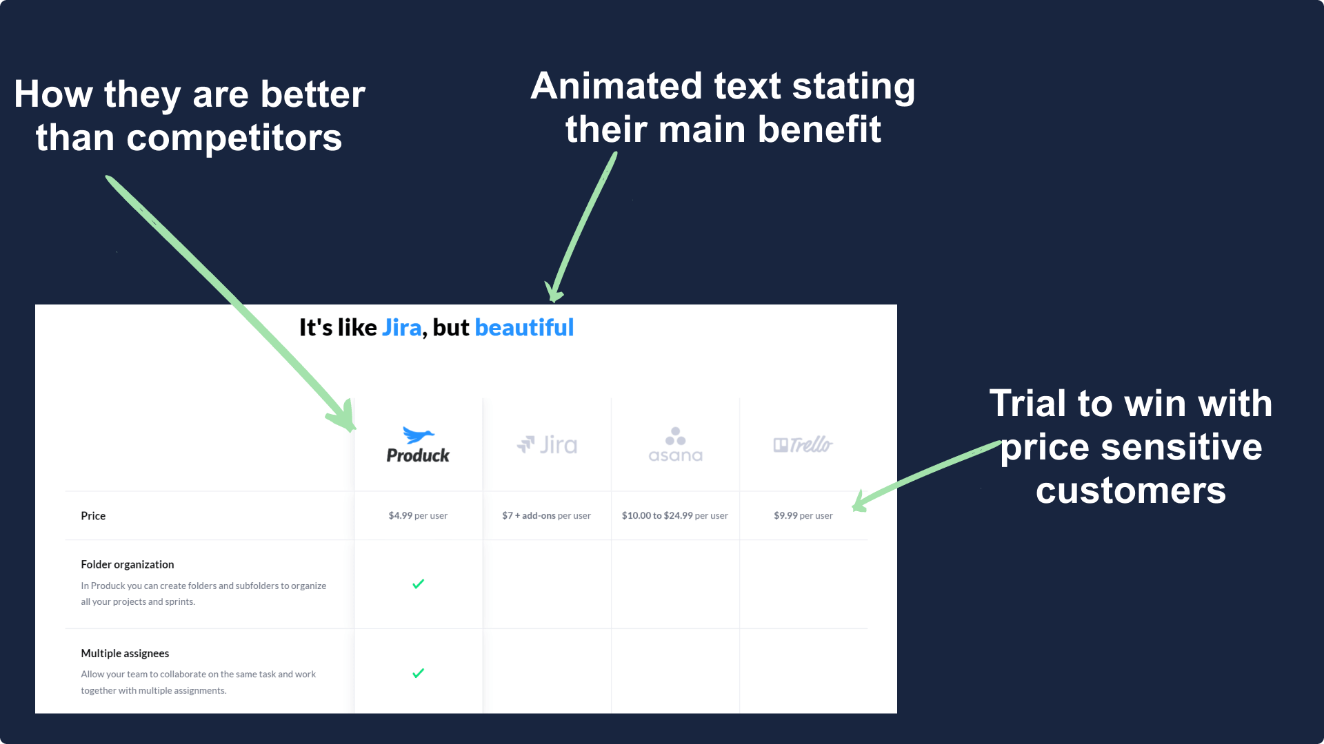
The role of this section is to show their superiority to unmotivated visitors. By showing their advantage they try to win the visitors back.
A great way to ensure that your audience doesn't choose your competitor over your product.
Summary
No special summary this week as today's issue was different and something I tried for the first time.
Did you guys like it? or have a suggestion? Feel free to leave a comment below, I personally read and reply to each of them.
Hope you guys have loved this week's teardown and feel free to reply with your thought on the same. Also if you want to suggest a website for our next teardown then do let me know and I'll consider it.
Also, do you mind motivating me with a cup of coffee?
Keep Building,
Ankit