
Top Hero Section Teardown
Hero section the first part of the landing page which the user will see and it needs to be exciting.


Hi,
Welcome to yet another interesting issue of Landing Letter also we are now a family of 1600+ members so that's great news too.
Enough of all that stuff and let's get back to our main content. Today we'll see the best examples of hero sections and understand why they are great.
Also as the hero section is the first thing that a visitor will see so it should have a lasting impact.
Let's see what we can learn from some of the most unique hero sections.
Suggestion: If possible try to open the respective pages simultaneously which you can refer to while reading this newsletter.
A word from our sponsor.
Example 1
The first example of the day is from Arrows.to, a collaborative customer onboarding tool.
Their hero section has lots of interesting components which we are going to have a look at.
The first thing to notice is the highlighted problem which they are trying to fix, this helps them product use-case in a glimpse.
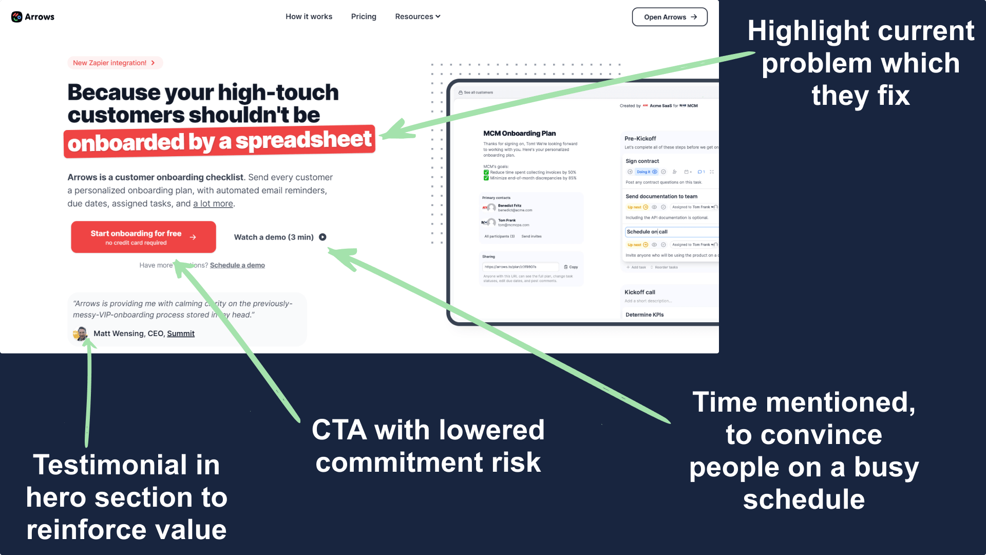
Next, you'll see two important CTA the first is a not so special one but the second one is interesting.
It says "Watch a demo (3 min)", you might think what's unique? We'll assume you are on the landing page and you really want to watch the demo but you are short of time.
That when the CTA comes into play, short of time? The demo takes only 3mins and you get convinced.
Example 2
The example is from Figma's FigJam, it's an online whiteboard kind of stuff they recently launched.
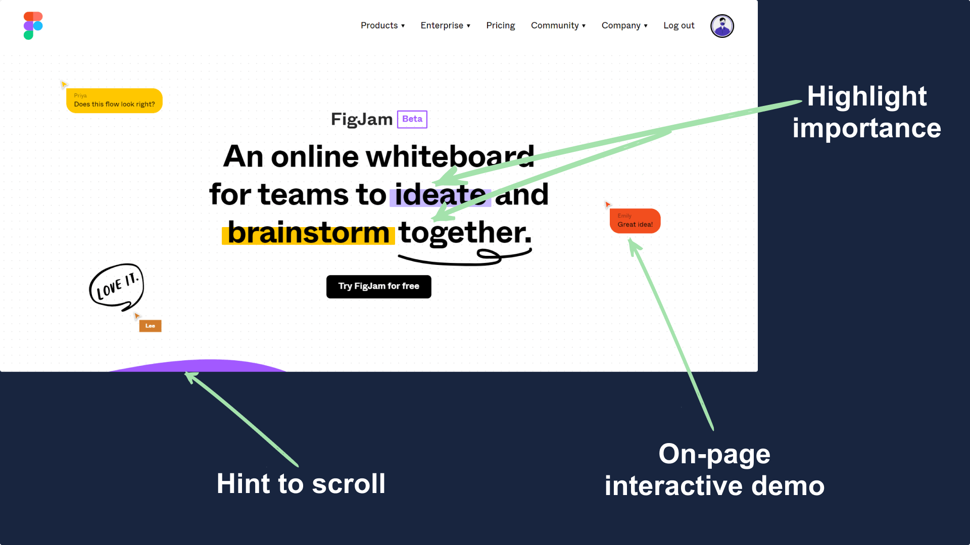
It's very similar to the above example but it has a different way of highlighting the important parts.
Additionally, if you'll visit their landing page you'll see the hero section is actually interactive and you can use it as a whiteboard.
This helps them engage with the users quickly which leads to a better connection with the visitor.
Example 3
The next hero section example is from Auth0.com, a login API for businesses.
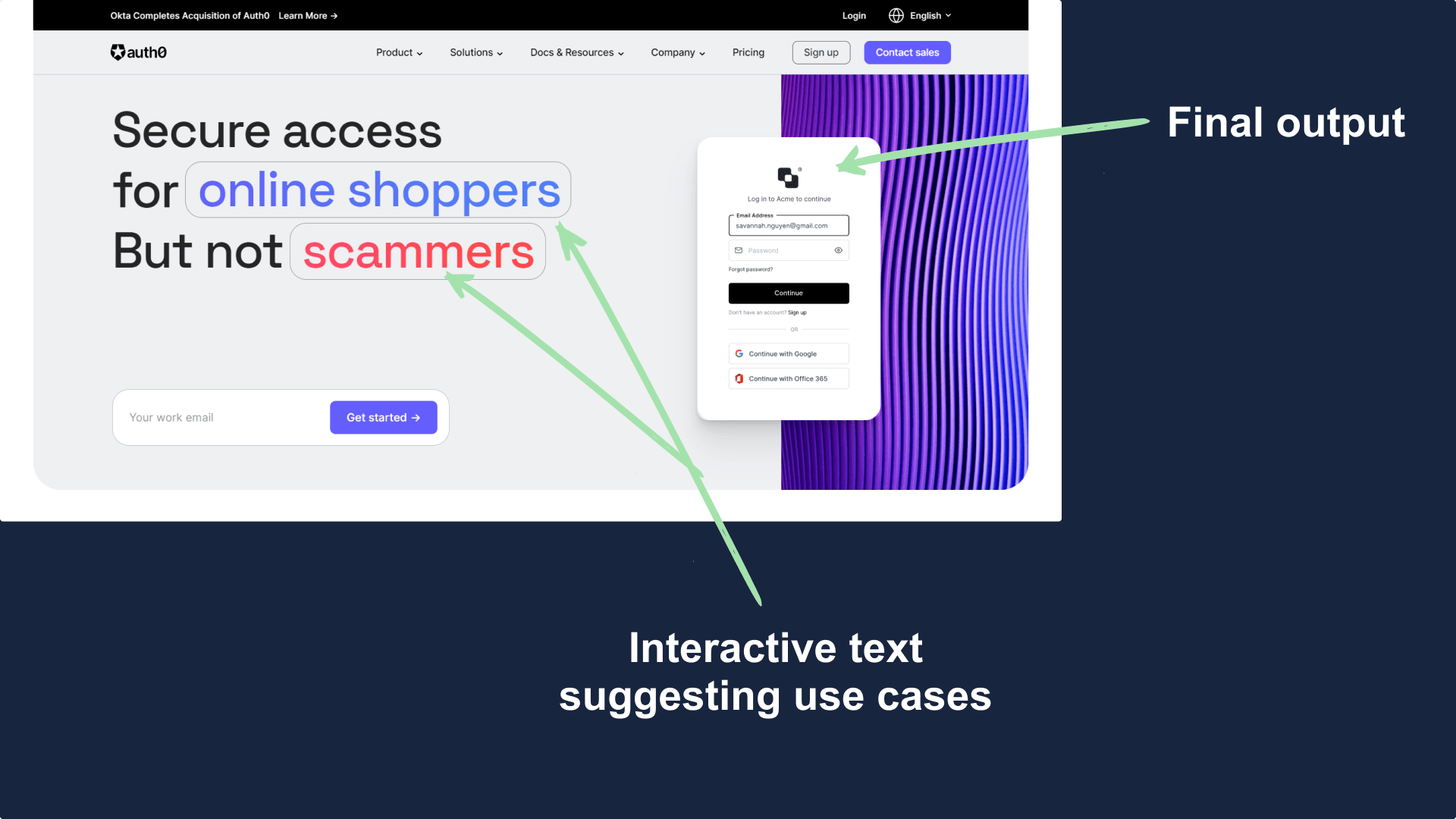
Their hero section has two important things which I should share. First, the image in the hero section quickly shows you what you can achieve.
Next, they have an animated highlighted words which keep changing and suggests all possible use-cases.
Example 4
This example is from Contra.com, a new product meant to replace resumes.
As they are focused towards jobs, they need to focus on diversity too. To portray this message they have used a clever way using diversified user images and details in their hero section.
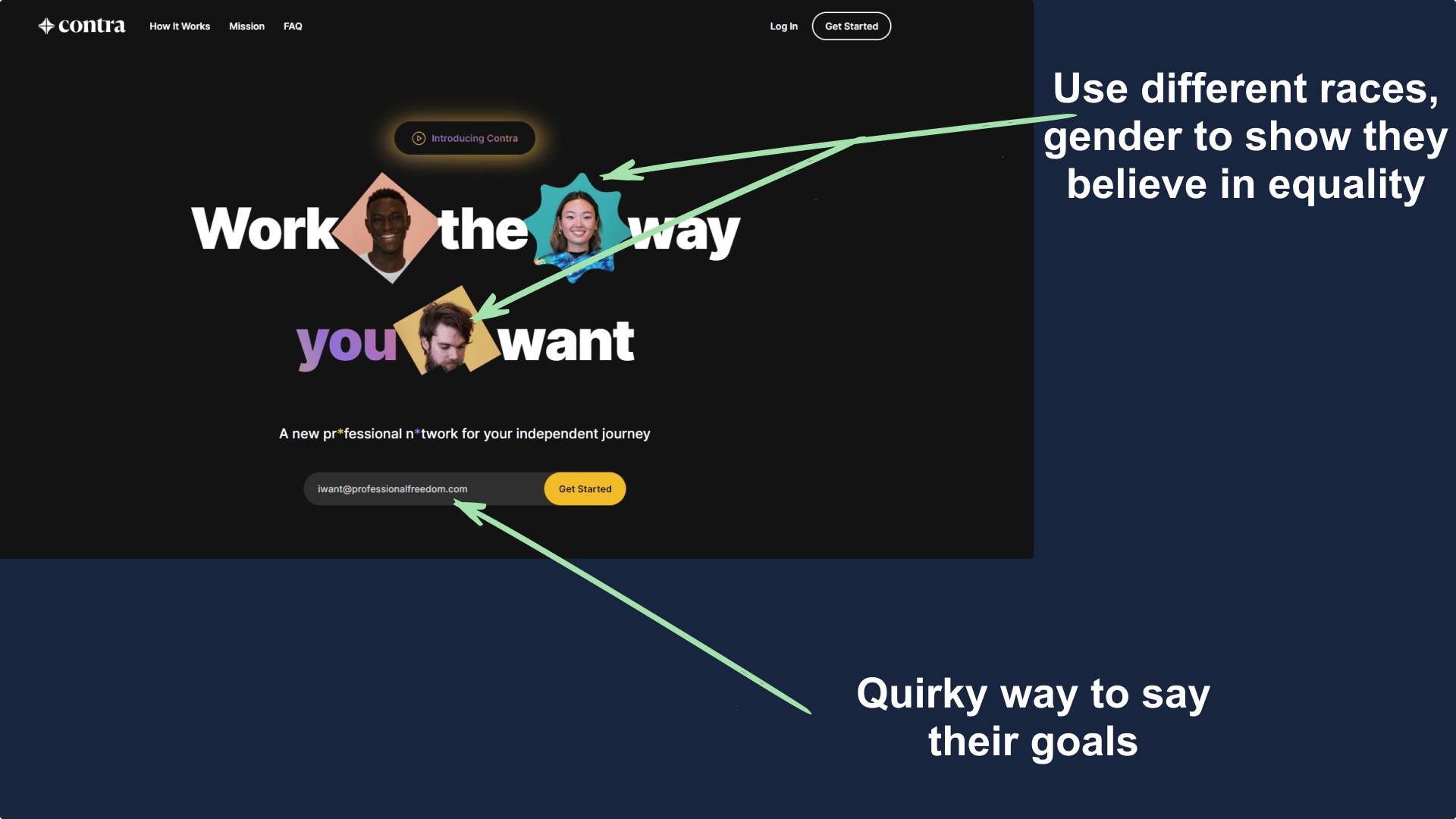
Also, the placeholder for their input form is a great thing too, it clearly states what they'll help you achieve.
Example 5
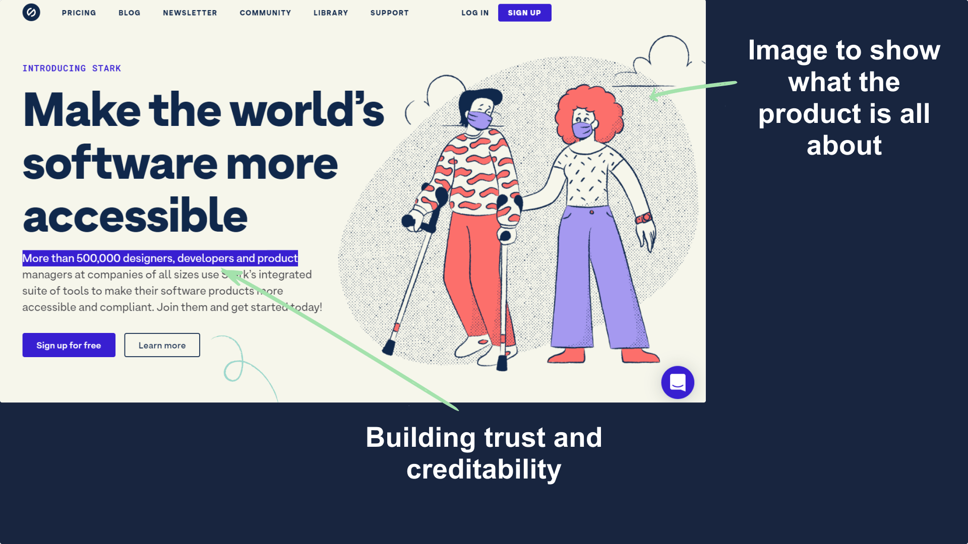
The last example of the day is from Getstark.co, an accessibility tool for design and development teams.
Two quick things to have a look at, first is using the sub-headline as a way to build product trust and the next is to use a hero image to show who is going to use it.
Summary
Here are some key takeaways from today's issue.
- Use the hero section to reinforce product value and creditability.
- Highlight things that are important.
- Keep the user engaged with the interactive hero section.
- Keep content simplified.
Hope you guys have loved this week's teardown and feel free to reply with your thought on the same. Also if you want to suggest a website for our next teardown then do let me know and I'll consider it.
Also, do you mind motivating me with a cup of coffee?
Keep Building,
Ankit