The proper way to write user testimonials on a landing page
Do you know the right way to use user testimonials on your landing page? Learn from the best examples.


Hi,
Last week, I experimented with my content, and you guys loved it, and I was extremely happy with all the feedback.
Today I'll be showing the best example of user testimonials on a landing page.
User testimonials help build trust and value which leads to higher conversion it's important too.
Let's see what we can learn from some of the great examples.
Suggestion: If possible try to open the respective pages simultaneously which you can refer to while reading this newsletter.
A word from our sponsor.
Example 1
Today's first example is from Shiftnudge.com, an interface design course.
It's one of the best looking ones that use striking colours to highlight the points one should surely look at.
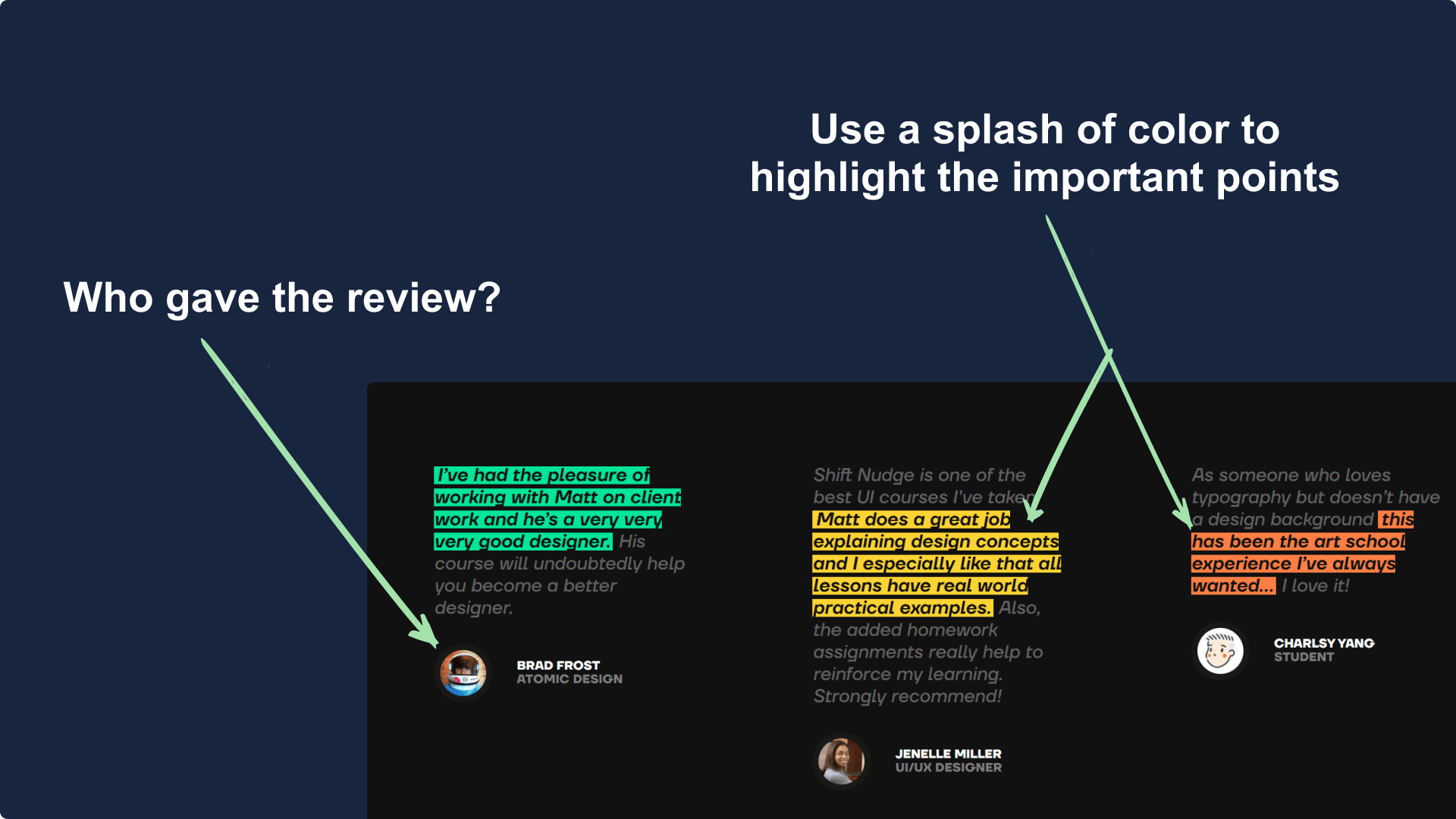
Also on hover, the testimonials get highlighted a bit more which provides great readability.
Just one caution before doing something like this, ensure that colour-blind people aren't your target audience, resulting in a poor experience for them.
Example 2
The next example is by Emailoctopus.com, it's the same tool that I use to send awesome emails to you guys every week.
I had done a teardown of their landing page in past and had shared that it's very much focused on user testimonials.
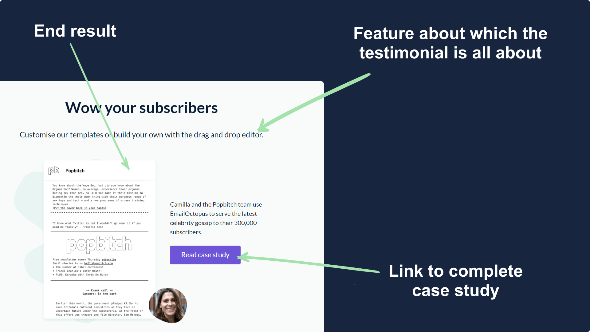
Here you'll see that the review has focused on only one feature at a time so it emphasizes what's been achieved by that specific feature.
The testimonial also links to a complete descriptive case study which again is a great way to keep the visitor engaged.
Example 3
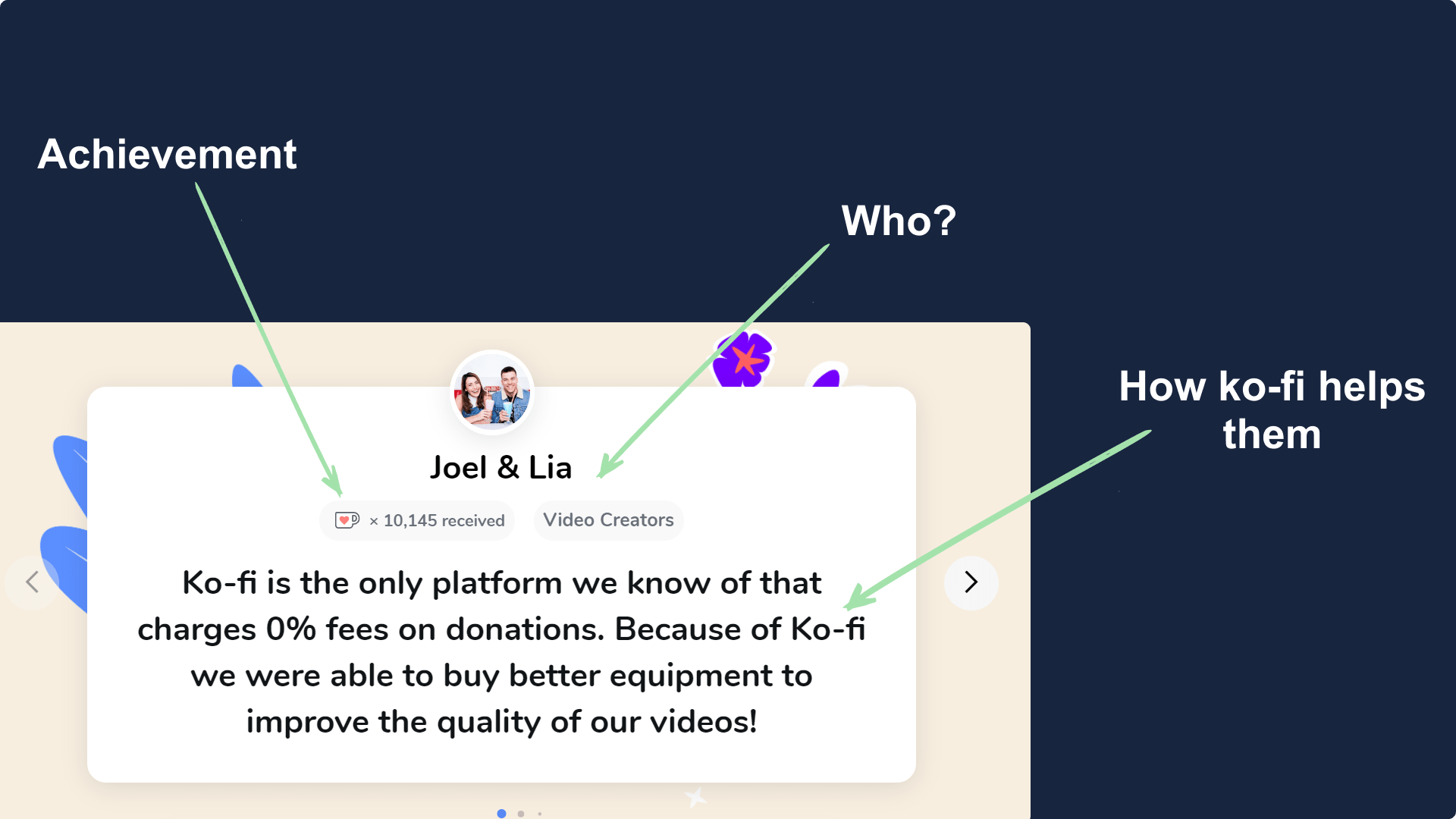
The next example is of a site we all know, Ko-Fi.com. For those who don't know it's a donation platform for creators.
In their testimonial, they keep focus on three things.
First what individuals achieved with help of their service/tool.
Next is that who are they and what they do. At last, comes the actual content which tells how Ko-Fi helped them in achieving something.
Example 4
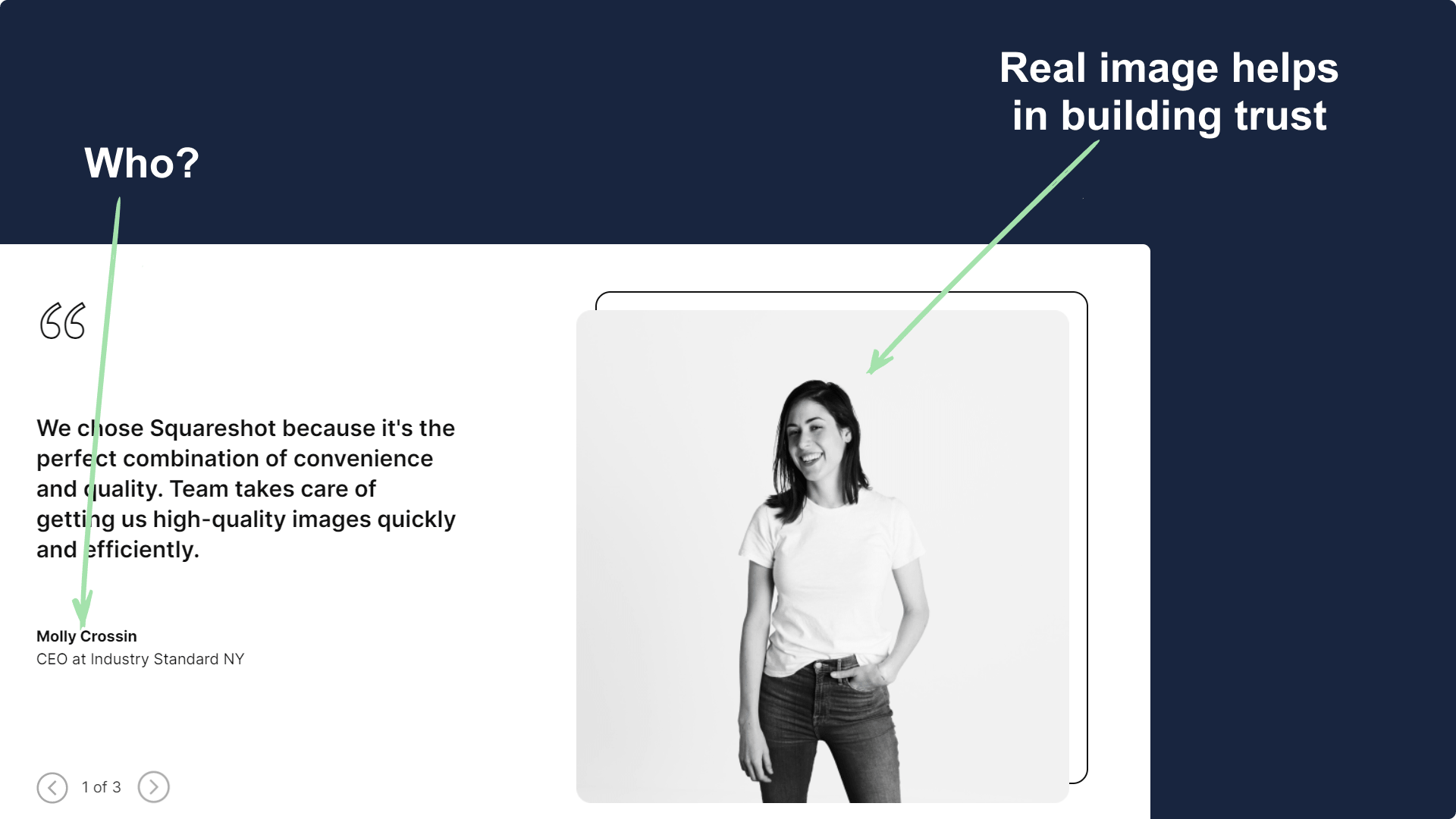
The next example is by Squareshot.co, a photography agency.
As they are a photography agency so they decided to use a nice portrait of one of their customer.
It then talks about how good the service was and what were they able to achieve.
Example 5
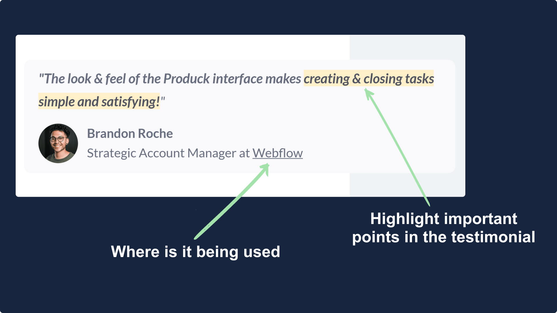
The example of the day is from Produck.io, an alternative to Jira and Asana.
Their testimonial section is quite simple but elegant. It's a short one that highlights the important phrase and shows that who they are and where it's been used.
Summary
- Keep things simple.
- Ensure you use pic of the user.
- Highlight important points.
- Show achievements and problems solved.
Hope you guys have loved this week's teardown and feel free to reply with your thought on the same. Also if you want to suggest a website for our next teardown then do let me know and I'll consider it.
Also, do you mind motivating me with a cup of coffee?
Keep Building,
Ankit