Splitbee Landing Page Teardown
This week I decided to teardown an Indie made SaaS and use that to explain what good and not so good things are there on their landing page.


Hi,
Last week was crazy, Landing Letter was on ProductHunt and it managed to be the 1st product of the day. This means that people like the concept behind it.
Also, I'm super thankful to everyone who joined the list, welcome to the family and I'll be leaving some more imp info in the pre-footer section.
Today I'm going to teardown Splitbee's landing page which is an indie made analytics tool.
Suggestion: If possible try to open the respective landing page simultaneously which you can refer to while reading this newsletter.
Here's a word from our sponsor
1. Header/Hero Section
Splitbee's hero section begins with a bold headline "Web Insights as Sweet as Honey" which does deliver the message but I would have preferred a simpler headline like "Simple yet powerful web analytics".
Next, they have a sub-headline that describes the tool in a simple format. Also, I like the fact they clearly highlight the important words there.
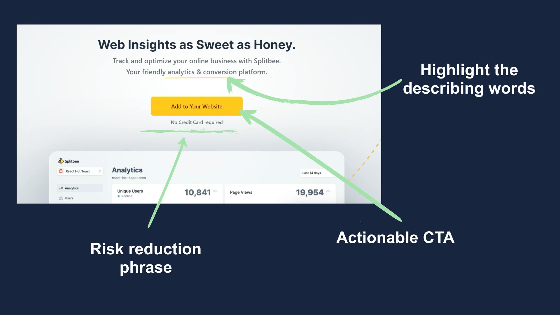
Their CTA is also non-generic which is known to perform better than the generic ones like "sign-up" or "join".
Below that you'll find a widely used phrase "No Credit Card Required", simple but work wonders in terms of initial conversion.
2. Demo & Users
After a small scroll, you'll see a big image of their dashboard on a multi-device mockup.
The aim is to deliver the message that it has been designed to be used in every device and not just a PC.
Apart from the image, you are also allowed to have a look at a demo dashboard so that one can give it shot before signing up.
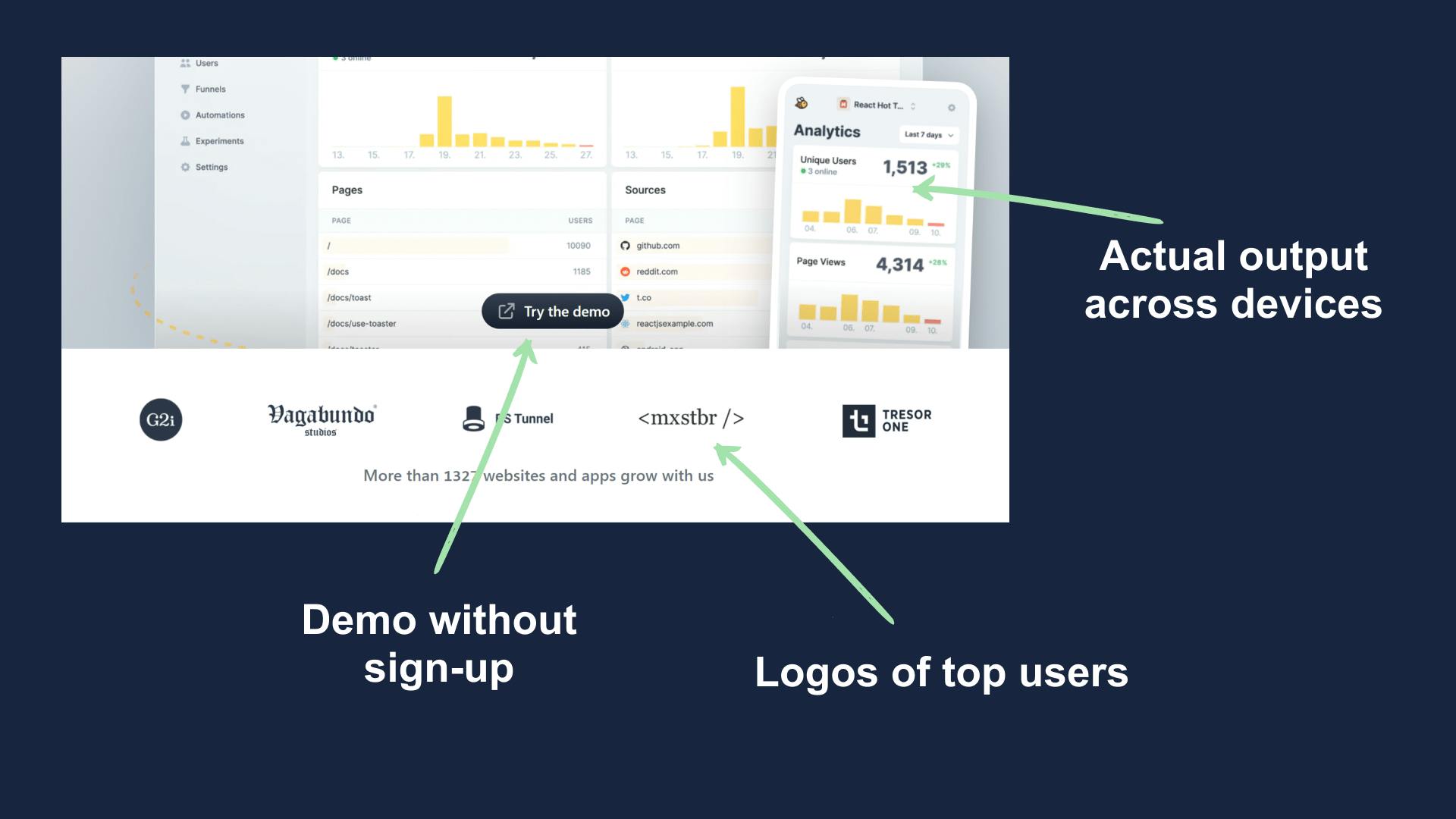
Below that you'll find some brand logos which are from the users of Splitbee, it's a good thing that they aren't faking anything by showing logos of very big brands.
Kudos to Splitbee on that.
3. Body (about analytics)
In the first body section, Splitbee talks about their first and most important feature, analytics.
I love it when brands show actual product image and not illustrated examples, it gives the visitor a clear picture of what to expect upon signup.
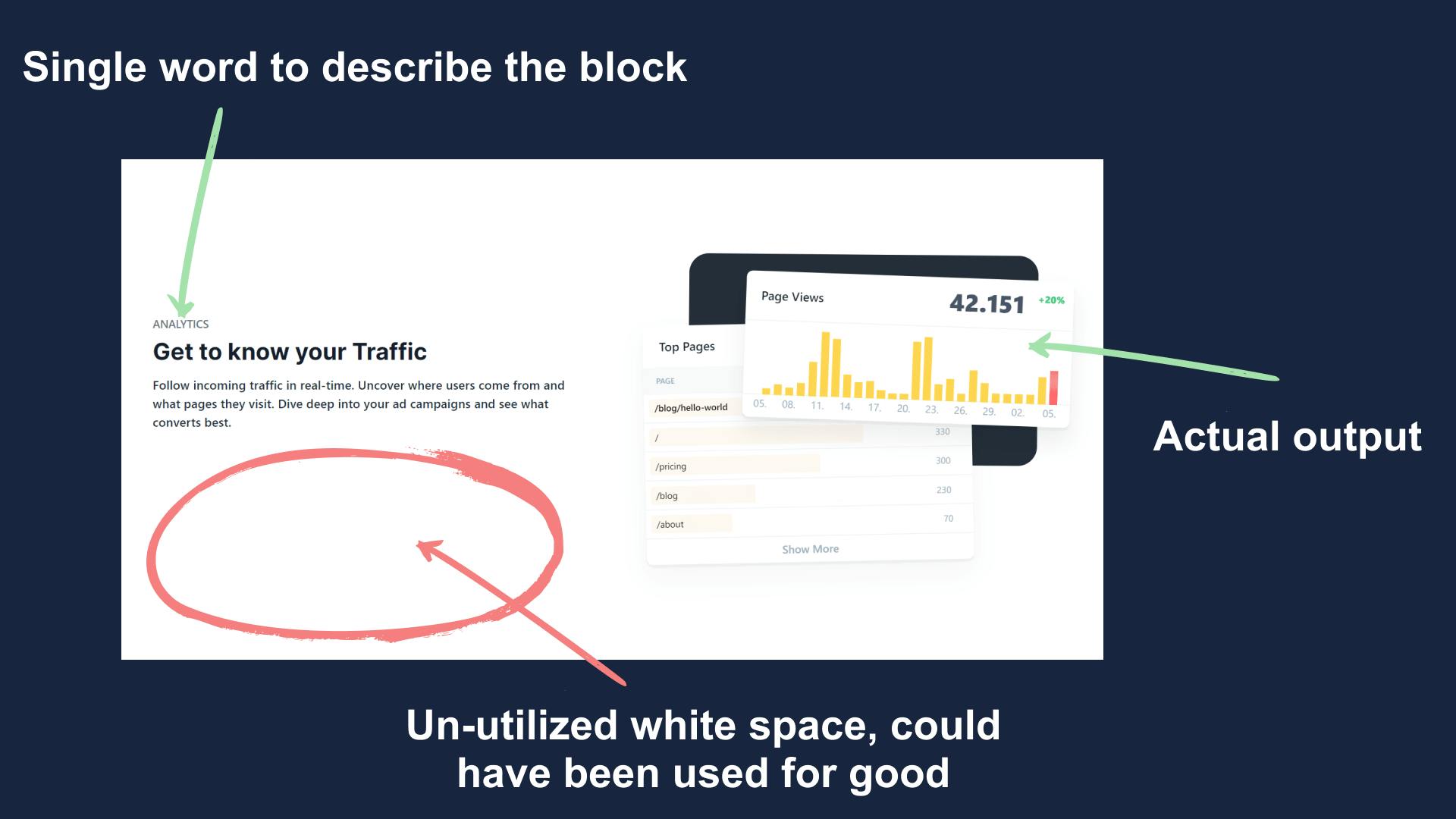
Though it's a nicely made section but it's not all good.
Do you see the red circle?
It's a lot of empty space, Splitbee could have used that part to post a customer review on how analytics help them in their business.
4. Body (about user explorer)
It's more or less the same as the above section. They have cleverly used a dynamic graphic here which shows visitors info.
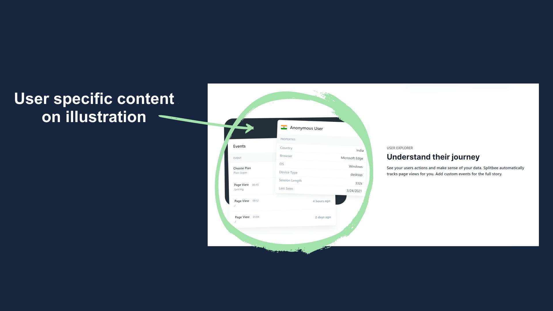
When I first saw my nation's flag there, I was very happy that how much they care about users from my country.
Later it turned out that it's dynamic data shown to every user, it's a really nice way of getting users interest in your product.
Digital payment giant Stripe also uses this same tactic in the hero section.
5. Body (user reviews)
Wasn't expecting this section but indeed a good move.
In general, brands keep talking about their specifications and features which starts to get boring.
To fix this Splitbee has placed the reviews section in-between two blocks so that there's a change of context.
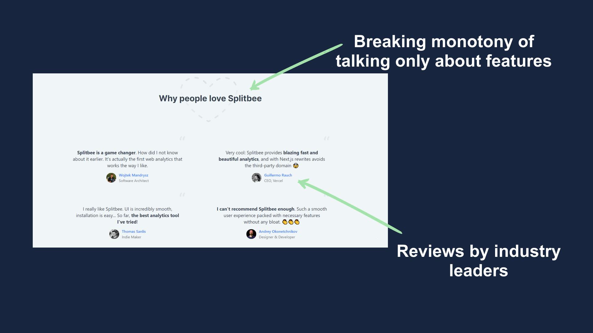
This section does two things, first breaks the monotony and the second is that it helps gain users trust.
6. Body (about insights)
This section is again very similar to what we have seen above but the illustrations holds the real magic.
Have a brief look, it talks about how their tools can be used in tracking user journey.
This might not look exciting to you but let me tell you, it's a very important metrics in the SaaS industry(their target audience).
That's why we should build landing pages for actual customers and not any broad audience set.
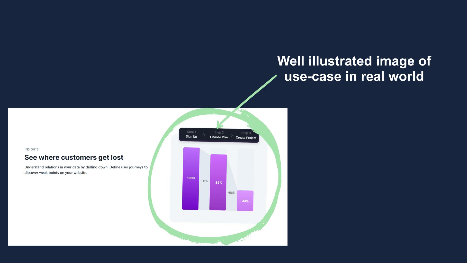
Though its a well-made section but it again has lots of empty space which could have been put into use.
7. Body (about automation)
Another important feature of Splitbee is automation and again the illustrators at Splitbee has used illustration to explain what's the use case.
They have also used Telegram logo which in a snap says what they connect with.
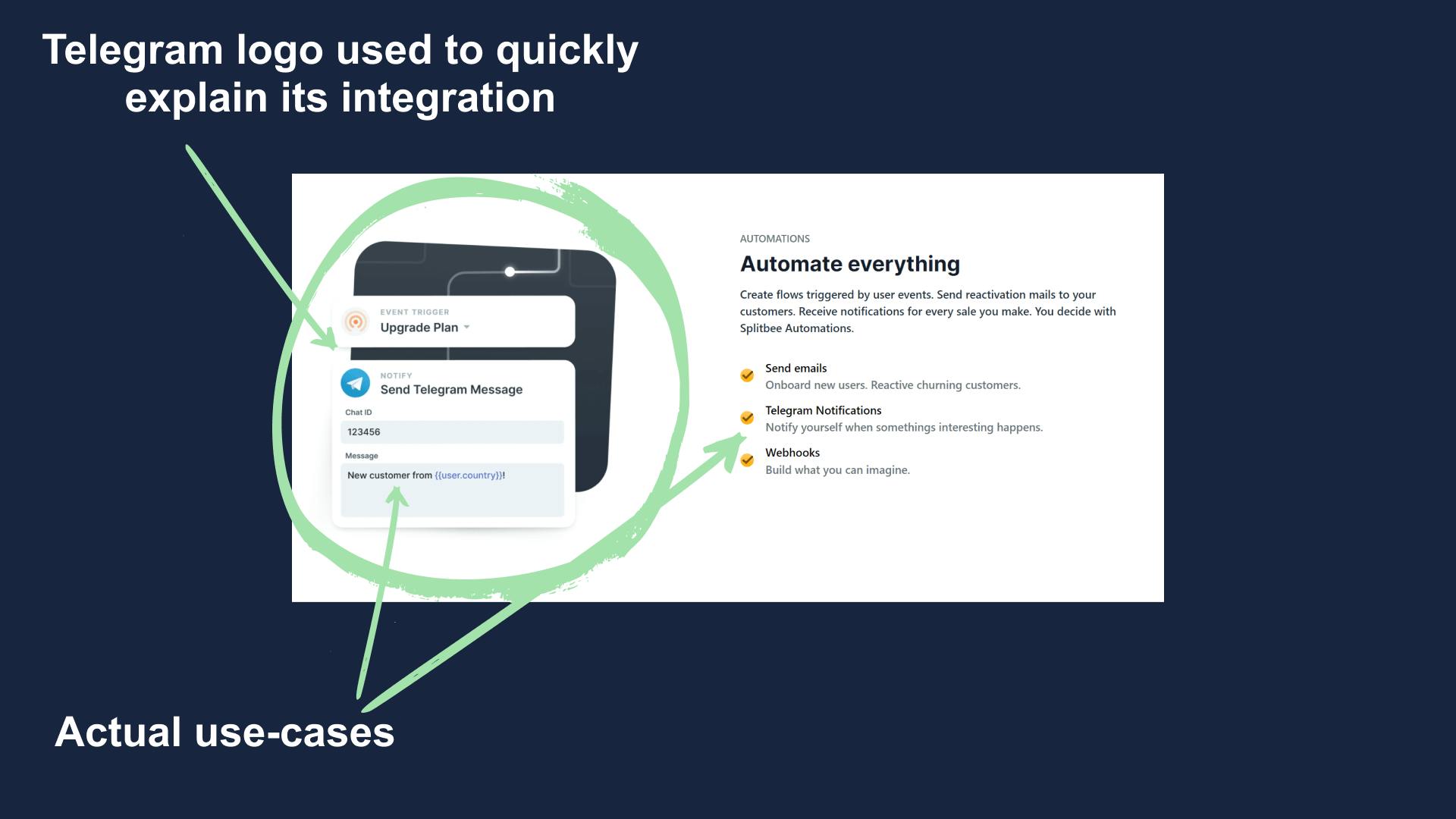
Also in this section, there isn't much of empty space as they have utilized it well.
8. Body (about features)
It's a trend in Splitbee's design where they add a different block after every two blocks of specifications.
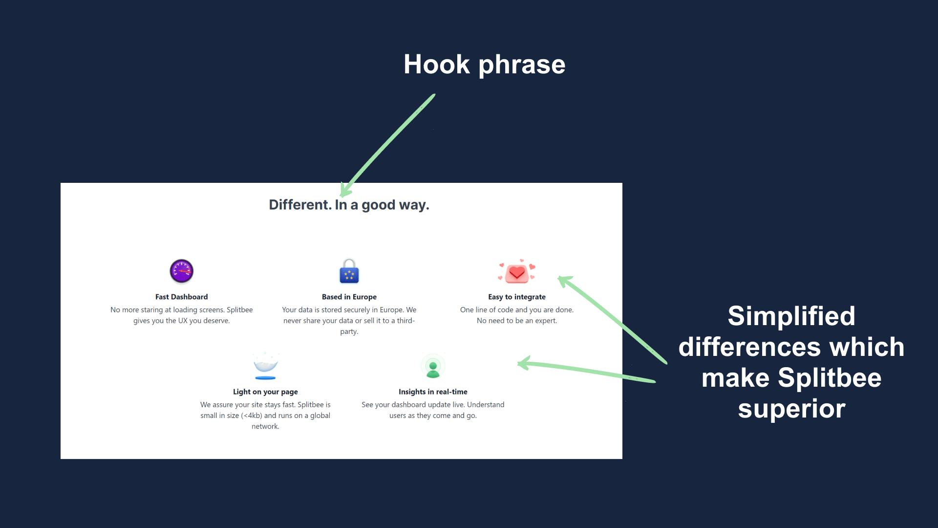
This section begins with a hook statement "Different, In a good way".
People first read "Different" and we know that we humans resist changes but then it says "In a good way" which assures that it's better than the present solutions.
8. Body (about A/B testing)
The name Splitbee is comprised if two words "Split-bee", it's a SaaS naming strategy whose formula is "Solution-Animal Name".
That's where the name comes from and Split refers to split-testing aka A/B testing.
This is where the makers want to connect the brand with, Splitbee = A/B testing.
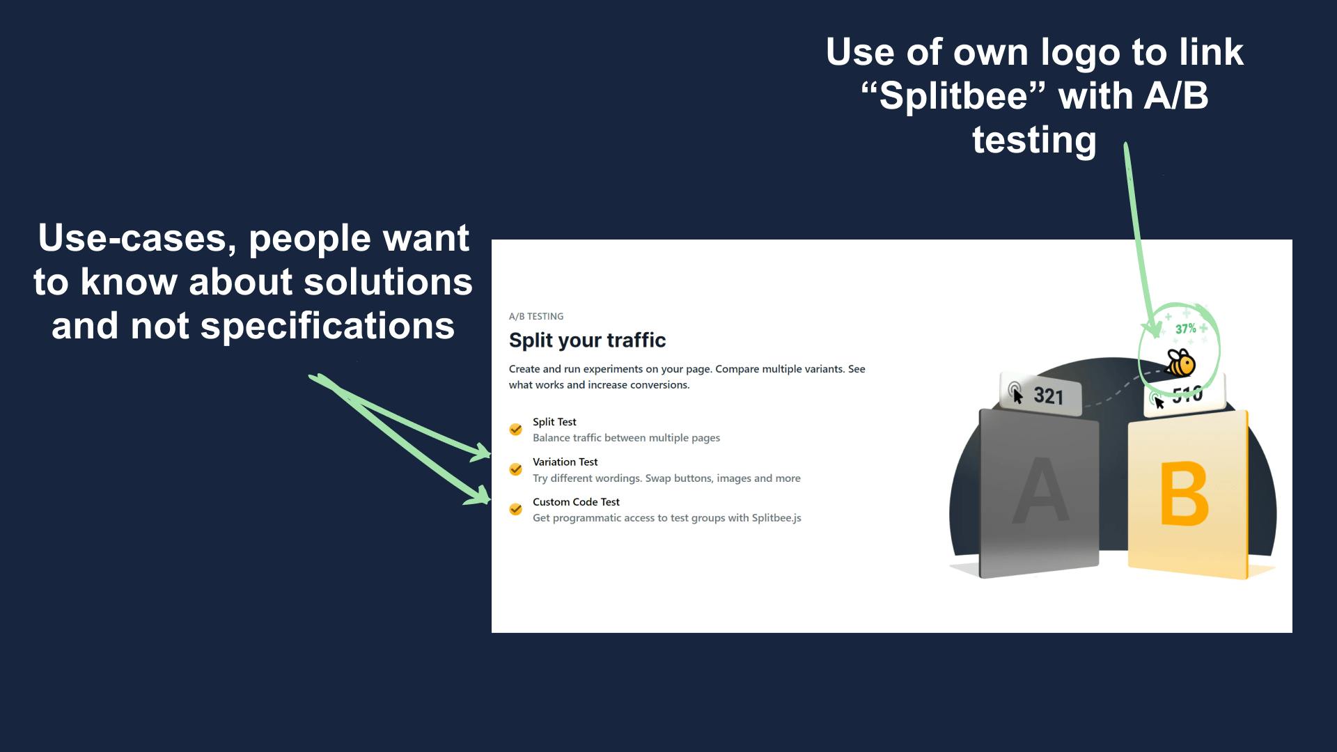
This is the only section where they are using their brand logo which shouts that Splitbee was made for A/B testing and people should connect them with A/B testing.
9. Footer
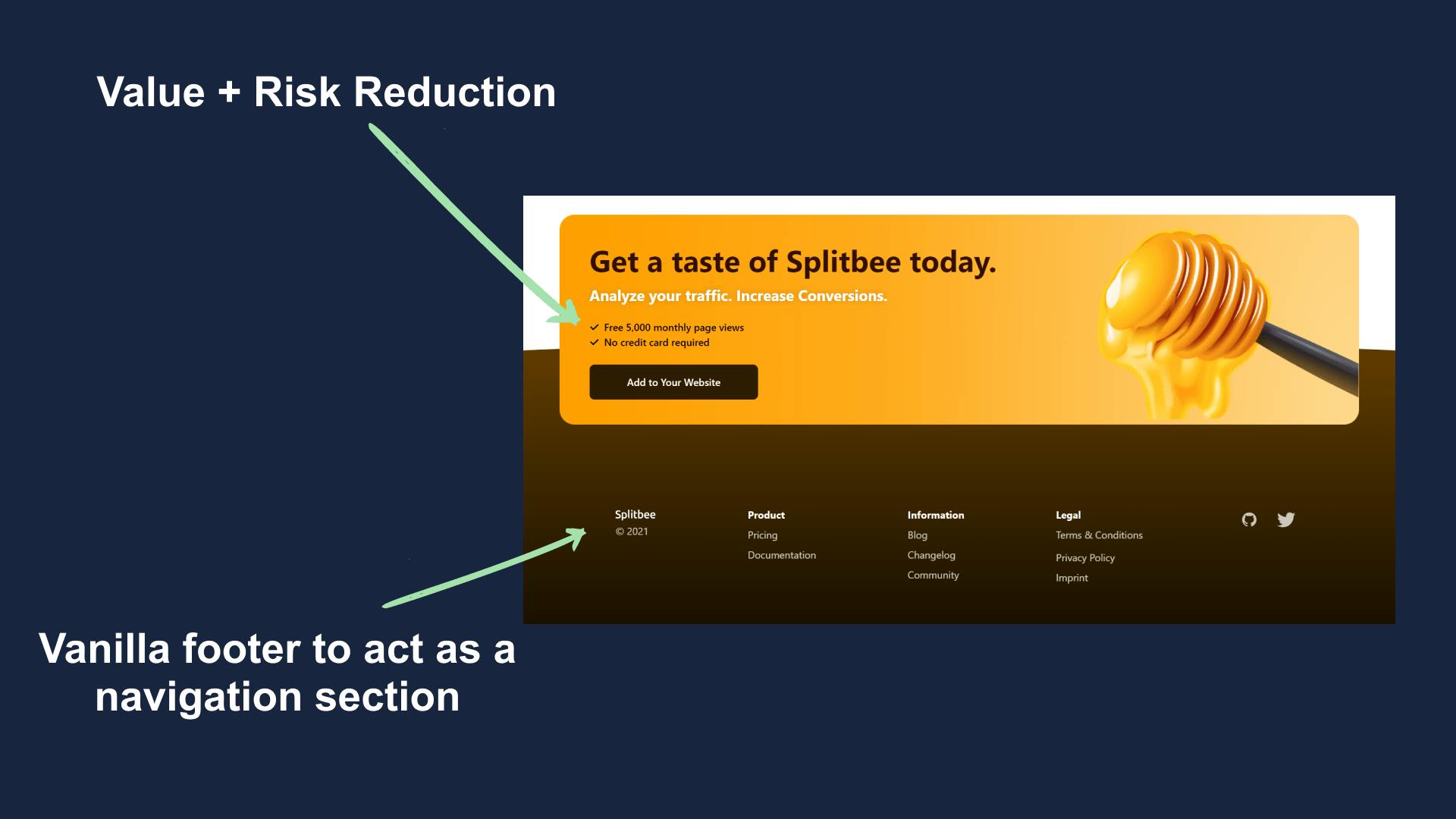
The pre-footer hold a CTA which says "Add your website" and has a risk mitigation statement that says that it's free till 5,000 visit's and no CC required.
This sends the message that there's no risk in trying hence people convert.
Summary
Splitbee is made by a very small team but it still has lots of things we can learn.
Here are the key takeaways.
- Actual images > illustrations.
- Show dynamic content which a user can connect to.
- Risk reduction for the user is essential for conversion.
- Generic CTAs are of no-use.
Hope you guys have loved this week's teardown and feel free to reply with your thought on the same. Also if you want to suggest a website for our next teardown then do let me know and I'll consider it.
Also, do you mind motivating me with a cup of coffee?
Keep Building,
Ankit