Kinsta Affiliate Landing Page Teardown
Recently I got intrigued by the details on the affiliate landing page of Kinsta and decided to write a teardown so I can share what I saw.


Hi,
I can't believe my eyes but it's true, Landing Letter is growing with tremendous speed and I'm overwhelmed with all the positive response.
To celebrate our growth I'll be sharing a unique landing page today, it's a landing page by Kinsta for their affiliate program.
Today we'll see how an affiliate landing page should be.
Let's see what we can learn from their unique landing page.
One more thing, I'm trying a new format today, let me know if you like it.
Suggestion: If possible try to open the respective landing page simultaneously which you can refer to while reading this newsletter.
A word from our sponsor.
Let's Start
So today we are looking at an affiliate page which means that Kinsta need not sell anything but it's still important to get good leads to join.
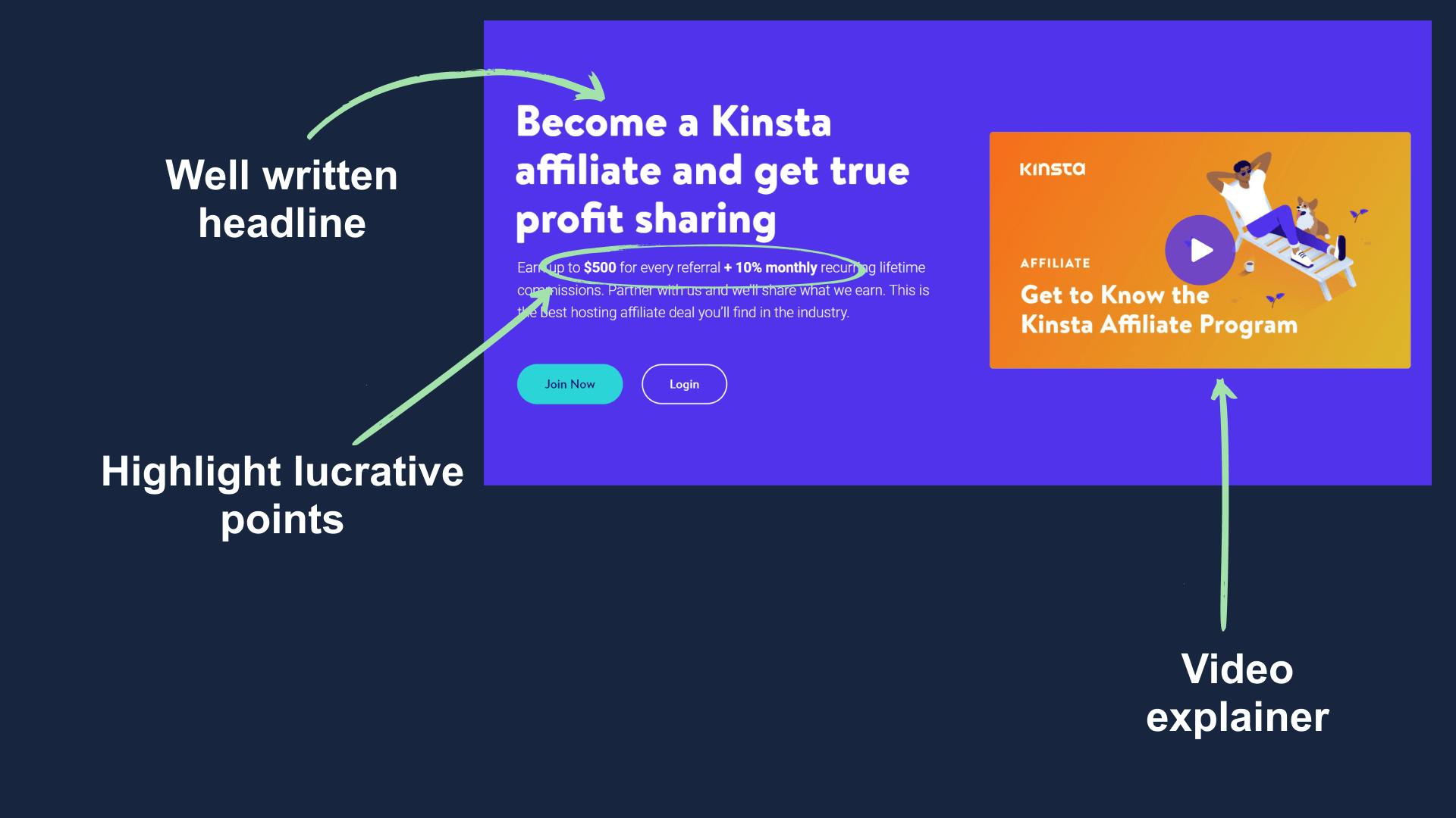
The hero section is pretty basic with a nicely written headline and video explainer but the good thing is in the sub-headline section.
They have highlighted the numbers by using a higher font-weight which helps them grab user's attention.
One thing I didn't like was their CTA, it feels boring. They could have alternatively used something like "Start Earning", which would have a bit more actionable.
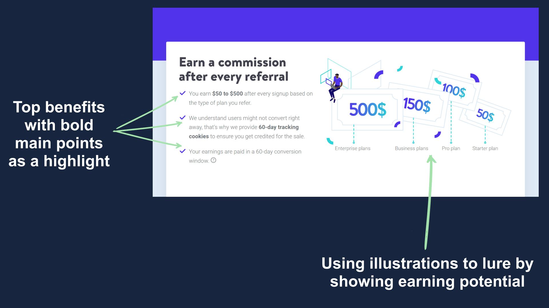
Next in their first body section, they talk all about what one can get from referring them.
They cleverly used their graphics here which supports the mentioned point and that helps them get the needed attention.
They again highlight the numbers here as we know that affiliate is all about income and numbers.
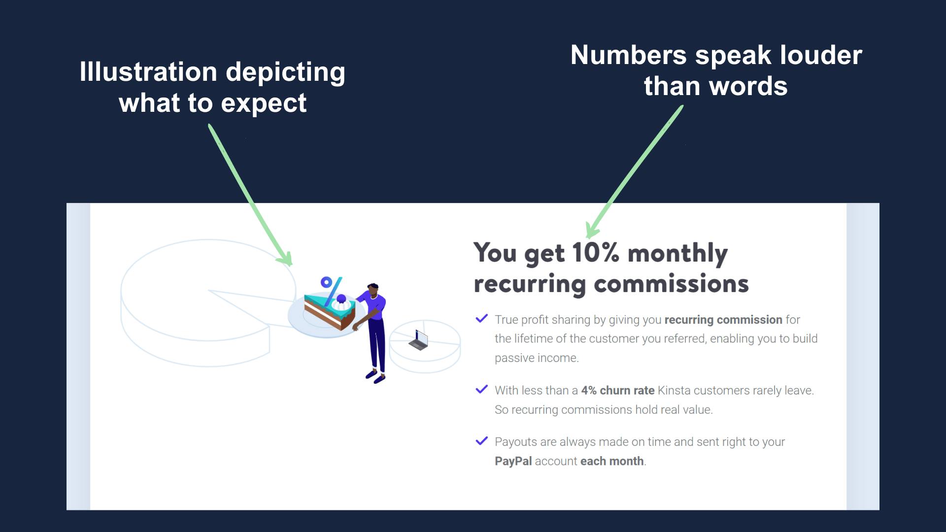
The same story is repeated here so I don't think it worth explaining again but do check the labelling in the below screenshot.
Now, this a game-changer move by the developers of the landing page. They have used a micro widget here whose job is to motivate the visitor into joining the program.
Here you can see an interactive calculator which tells earning potential, the good thing is that this widget makes it look very easy to make income and that helps in more conversion.
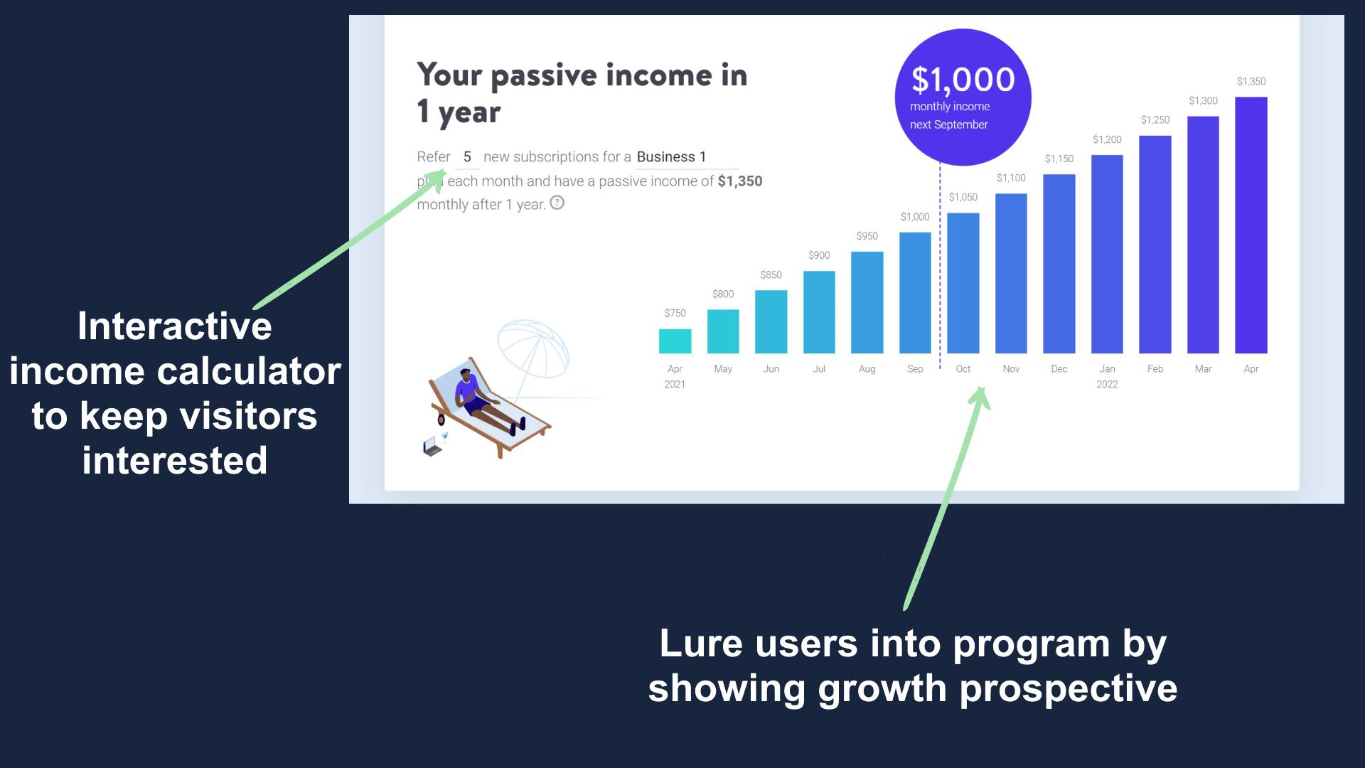
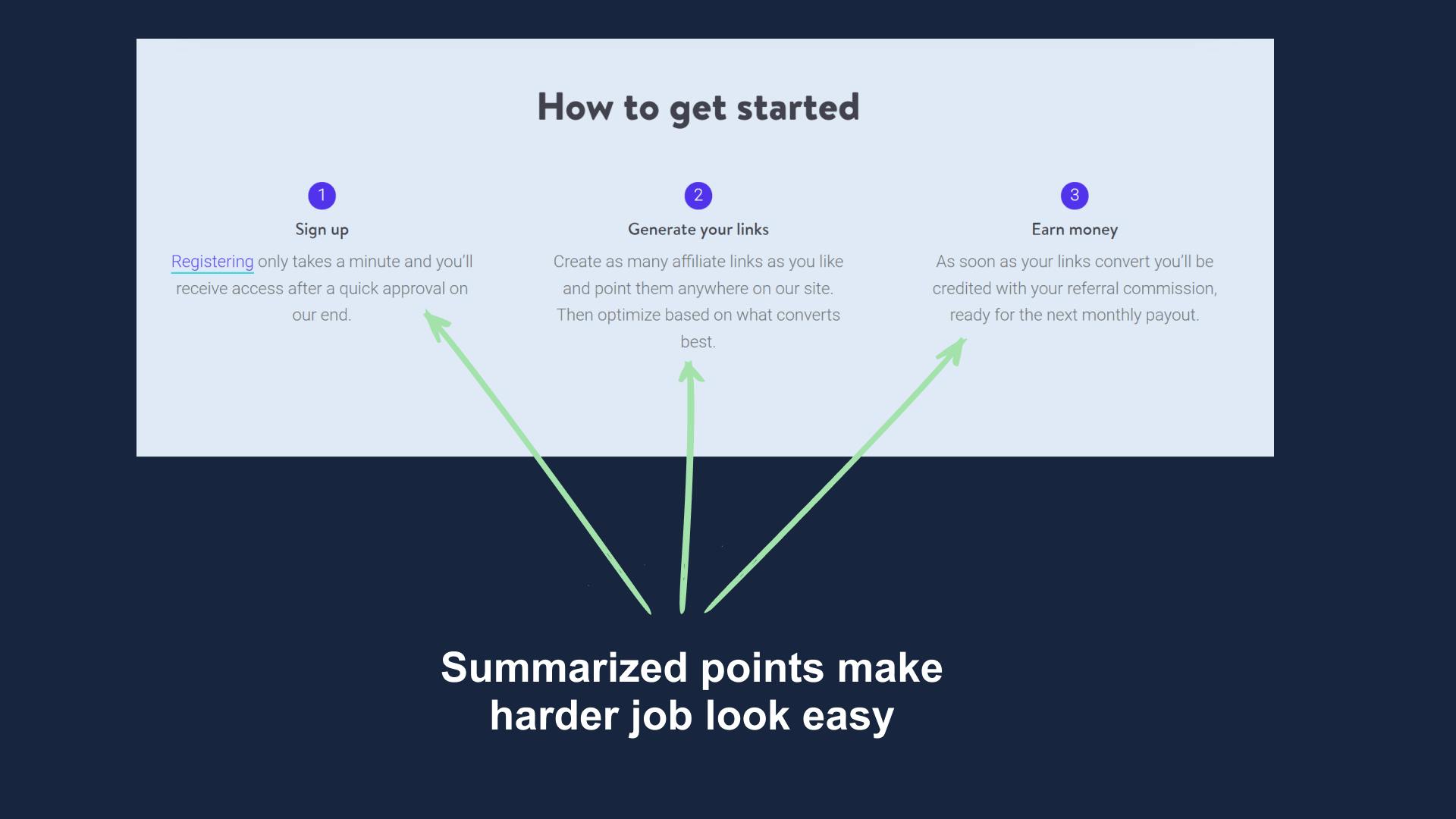
Next are the points on how to get started and you'll notice something cool here.
Check points 2 and 3, look how quickly they jump to earning money? We'll this a way of telling the visitor that it's easy to make money.
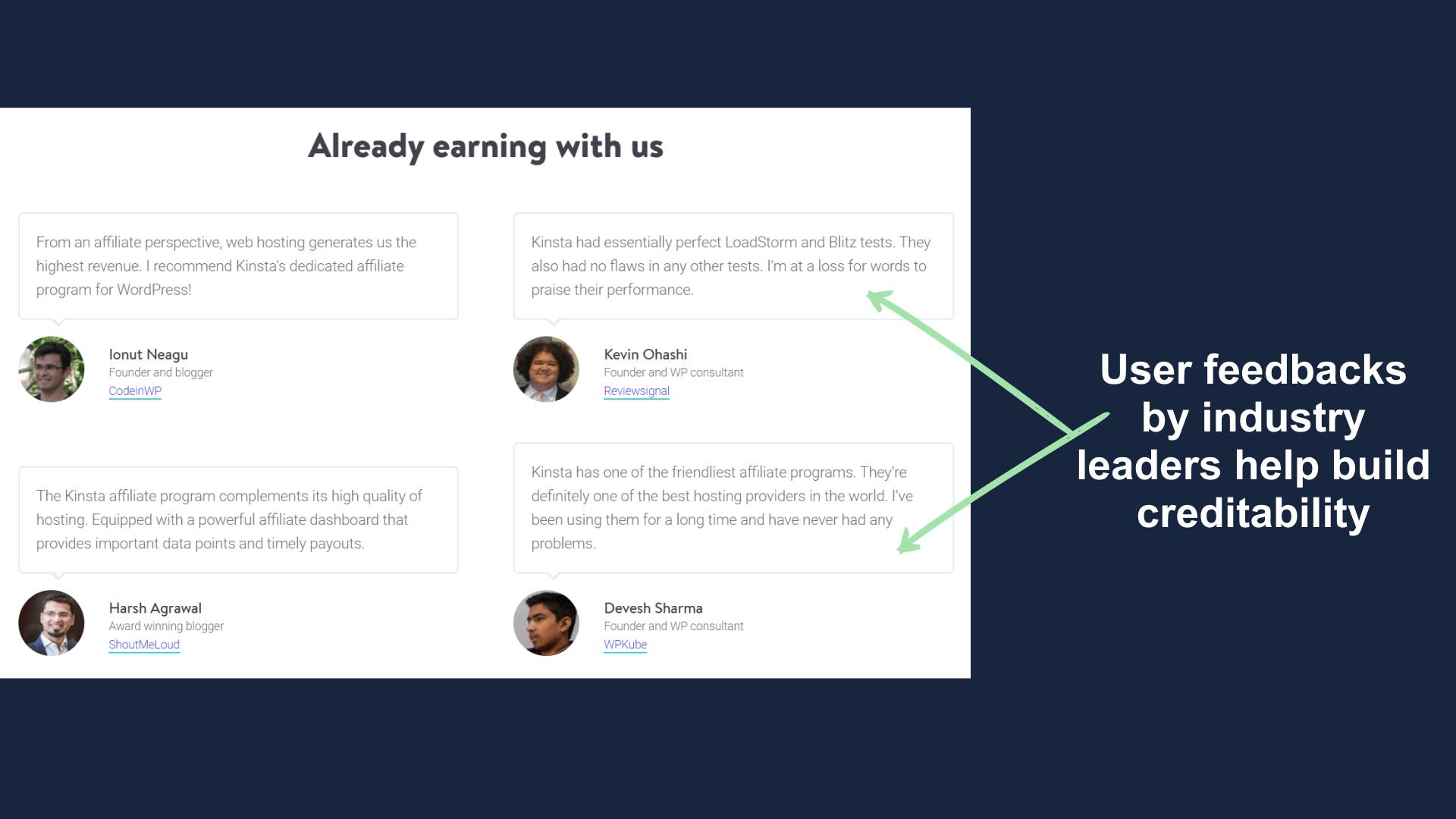
Next up are reviews and feedbacks by well-known people in the industry.
Whenever one looks at these, he or she thinks "If they liked it then I should like it too".
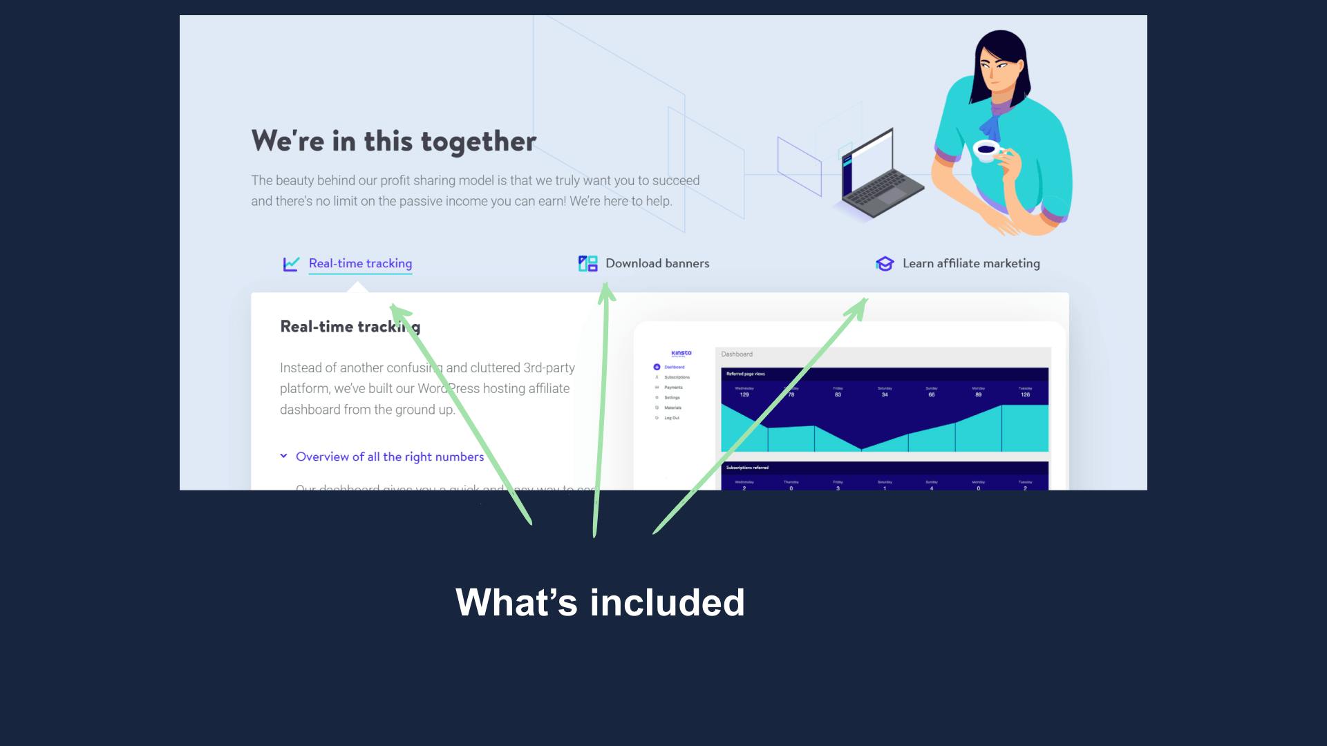
In the next section you'll be seeing up "How Kinsta helps you", it's nothing but basically and tools and education they provide.
This tells the visitor that they care about referrals and have the same benefits for everyone.
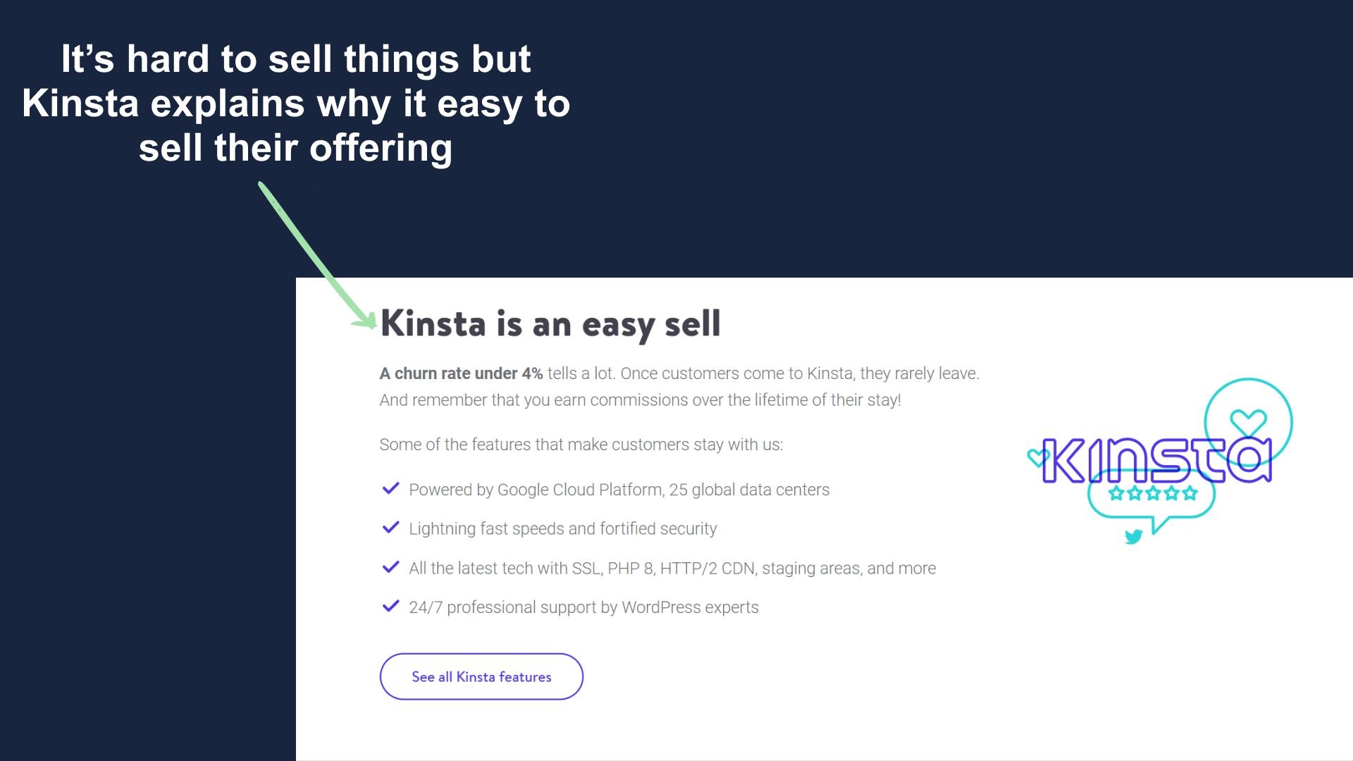
Remember in the beginning I told you that it's an affiliate landing page and the goal is to not sell anything but get people to sign up.
This plays an important role, everyone wants to make some dollars but it's hard to sell.
Here Kinsta steps in and says, "We are different and here's why our service is easier to sell".
This again does the job of getting the user motivated into the program.
I decided to skip the footer today as there wasn't anything special in it and didn't want to waste your precious time.
Summary
Kinsta's affiliate landing page is a pretty unique one and one of the best I have seen so far.
Some things we can learn from it.
- Users need motivation to buy/join.
- Numbers matter when a product or service is related to money.
- Micro widgets are helpful in keeping user hooked.
- Add customer review or success stories.
Hope you guys have loved this week's teardown and feel free to reply with your thought on the same. Also if you want to suggest a website for our next teardown then do let me know and I'll consider it.
Also, do you mind motivating me with a cup of coffee?
Keep Building,
Ankit