Gumroad Landing Page Teardown
Gumroad is in the centre of the creator economy and its landing page needs to be explained well to the creators, hence this article.


Hi,
Another week, another teardown but a special one this time.
We are seeing tremendous growth in the creator economy these days and Gumroad is the major player in this space. It helped many make their first dollar on the internet.
Let's see how's their landing page and is it the best? Or needs improvements.
Also sorry for sending this issue a bit late but couldn't help as dealing with some lockdown related issues, hope you guys will understand.
Suggestion: If possible try to open the respective landing page simultaneously which you can refer to while reading this newsletter.
A word from our sponsor.
1. Hero Section
Let's begin with the good things about Gumroad's landing page.
The first thing which I absolutely loved was the heading. "Creator deserve to get paid for their work." this clearly gives the message that as a creator you need to monetize your content and Gumroad is the tool for that.
The CTA here is also actionable, nothing like sign-up or join. "Start selling", gives a direct message.
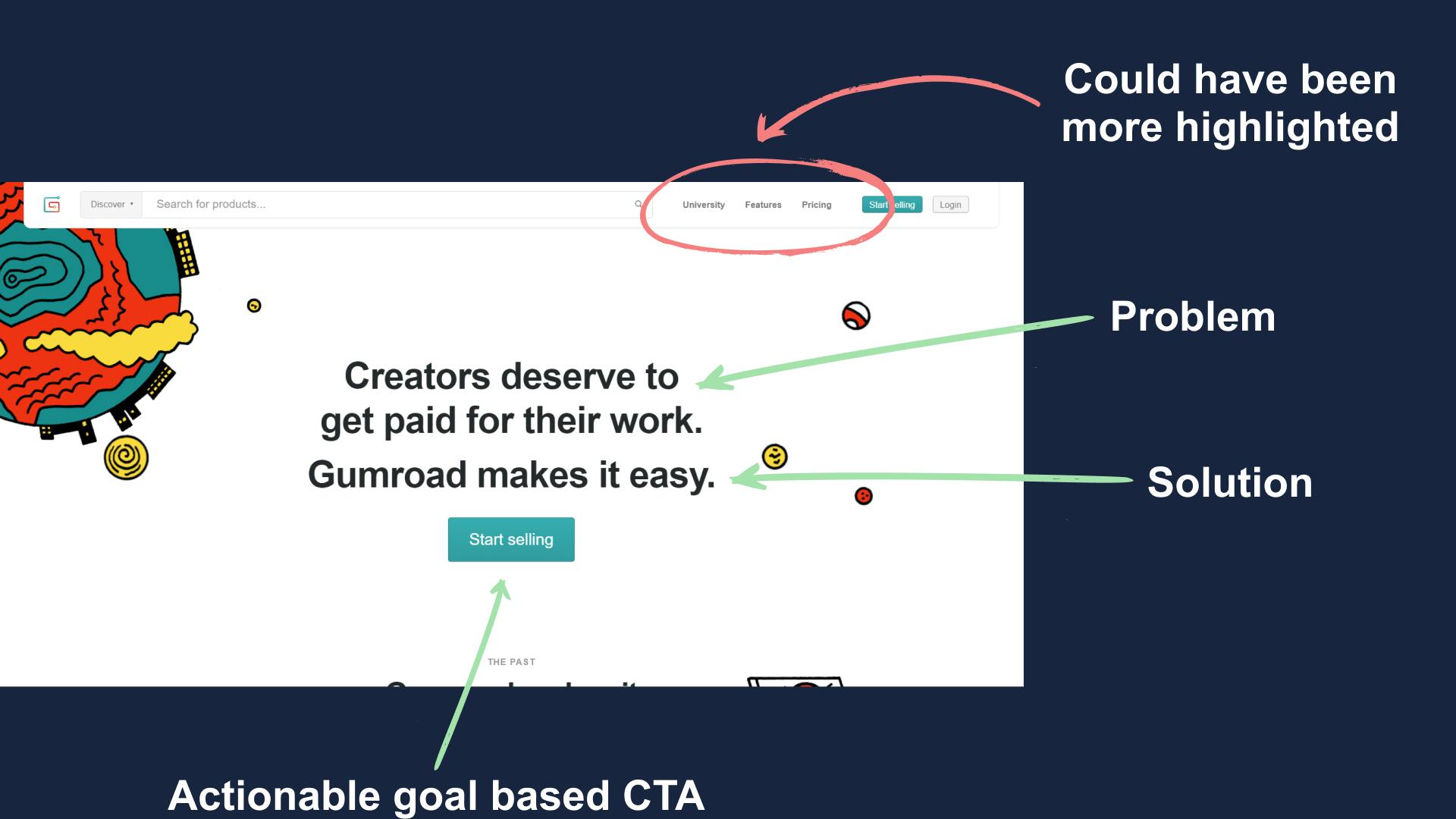
Now coming to the bad design points. First, there is the inconsistent spacing between the headlines in the hero section. Personally, I'll either make them equal or increase the spacing a bit more.
The second is that the menu section has a very small font, either they should remove it or highlight it.
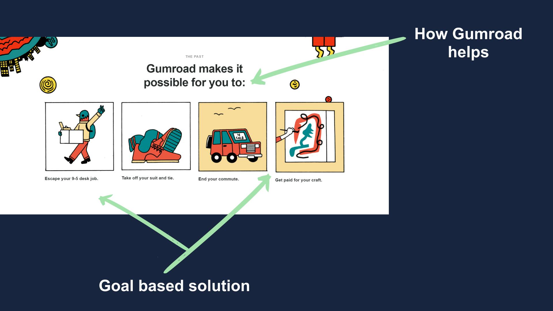
2. Body (How they help)
The first body section is about how Gumroad helps. They took a very creative to showcase why one should use Gumroad.
Remember I said that people want solution and not specification? It's the same here, they are focusing on how they help in achieving individuals goals and that makes it easier to acquire new customers.
3. Body (Creditability)
It's very important to establish creditability before you can convert visitors into users.
To do this Gumroad uses its top creator's profile pic and add them to the landing page and visitors can go to their profile and check.
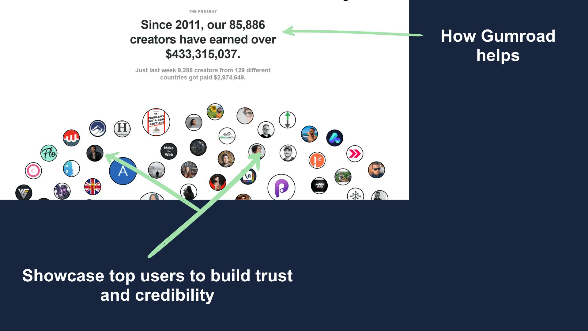
Doing this makes the visitor believe that if these creators can be successful on their platform then they too can.
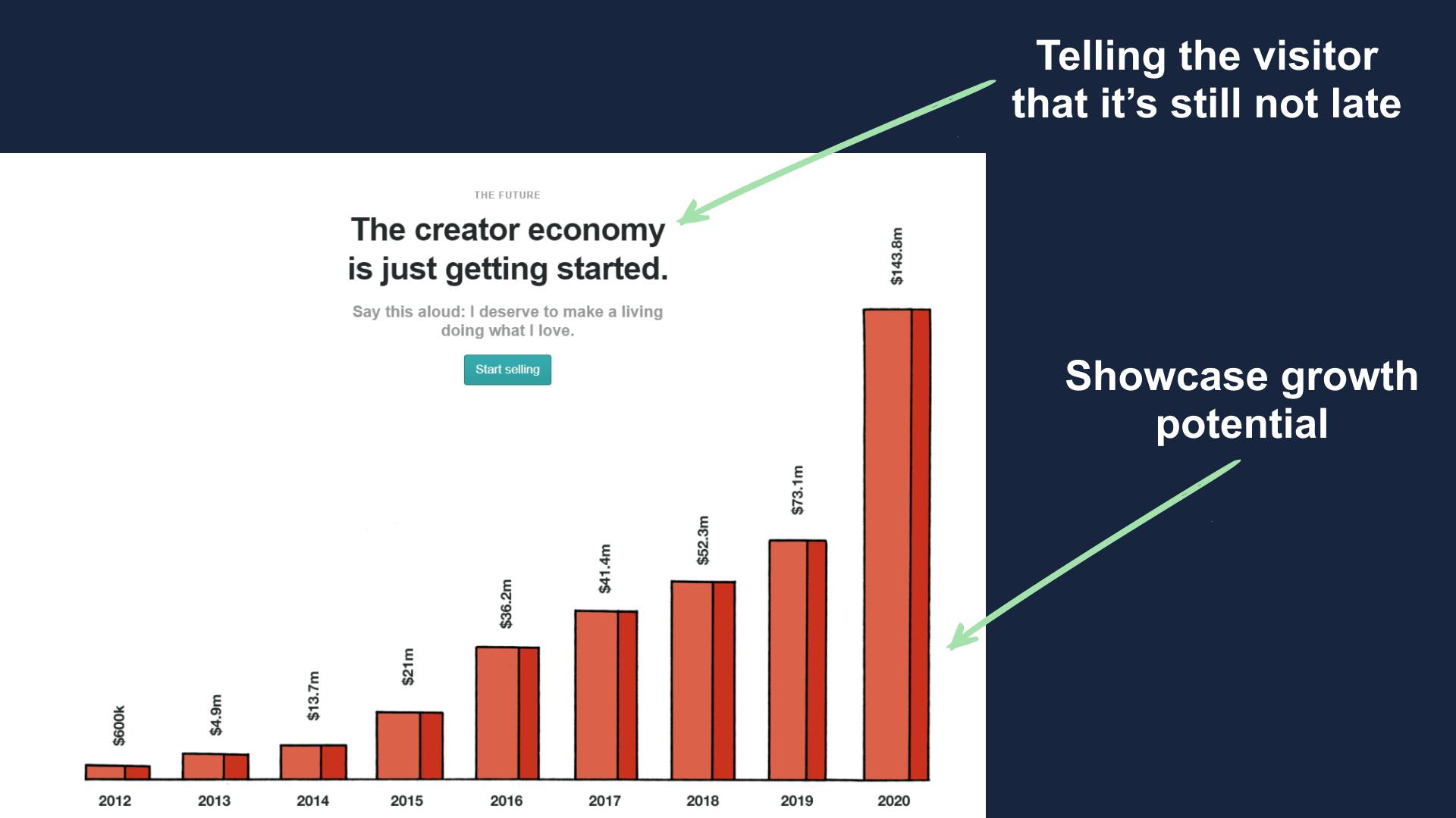
4. Body (Creator economy)
The main goal of Gumroad is to help creator make money and to do that they constantly need to motivate people into becoming creators.
To do this they added a graph which shows that how quickly the creator economy is growing and create a FOMO effect.
They say that it's just the start which people join the wagon and no one wants to left out.
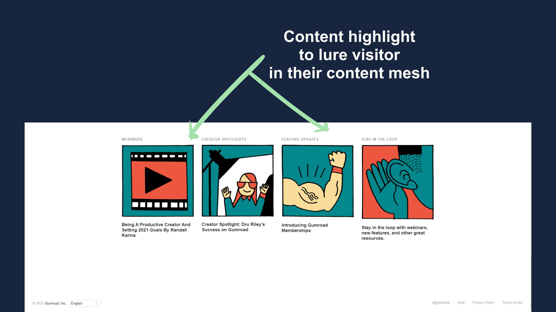
5. Footer
The pre-footer and footer is very vanilla and there isn't much to say about it. They just link to their different content types which keeps the user engaged.
Improvements
You must have noticed that the landing page is very small and lacks unique information. Well, that's true and I'll be telling you how could this be fixed.
Here are few things that could have been added.
- It lacks user reviews, adding them would surely level up their game.
- They should have showcased some case studies on their landing page to make it more solution-oriented.
- The page lacks a FAQ section, adding a list of handpicked FAQ's will help to clarify commonly asked doubts.
Summary
Overall Gumroad has a nice landing page but I think they can take it to a new level but putting more work into it.
Hope you guys have loved this week's teardown and feel free to reply with your thought on the same. Also if you want to suggest a website for our next teardown then do let me know and I'll consider it.
Also, do you mind motivating me with a cup of coffee?
Keep Building,
Ankit